Table of Contents
You've seen multi-column layouts before. Newspapers, magazines, and books all utilize this technique to help divide their content up into columns that are easier to digest and read.
Luckily for us, CSS makes it really easy for us to define and use our own columns. We'll explore how this is done using CSS columns and their properties.
Column Count
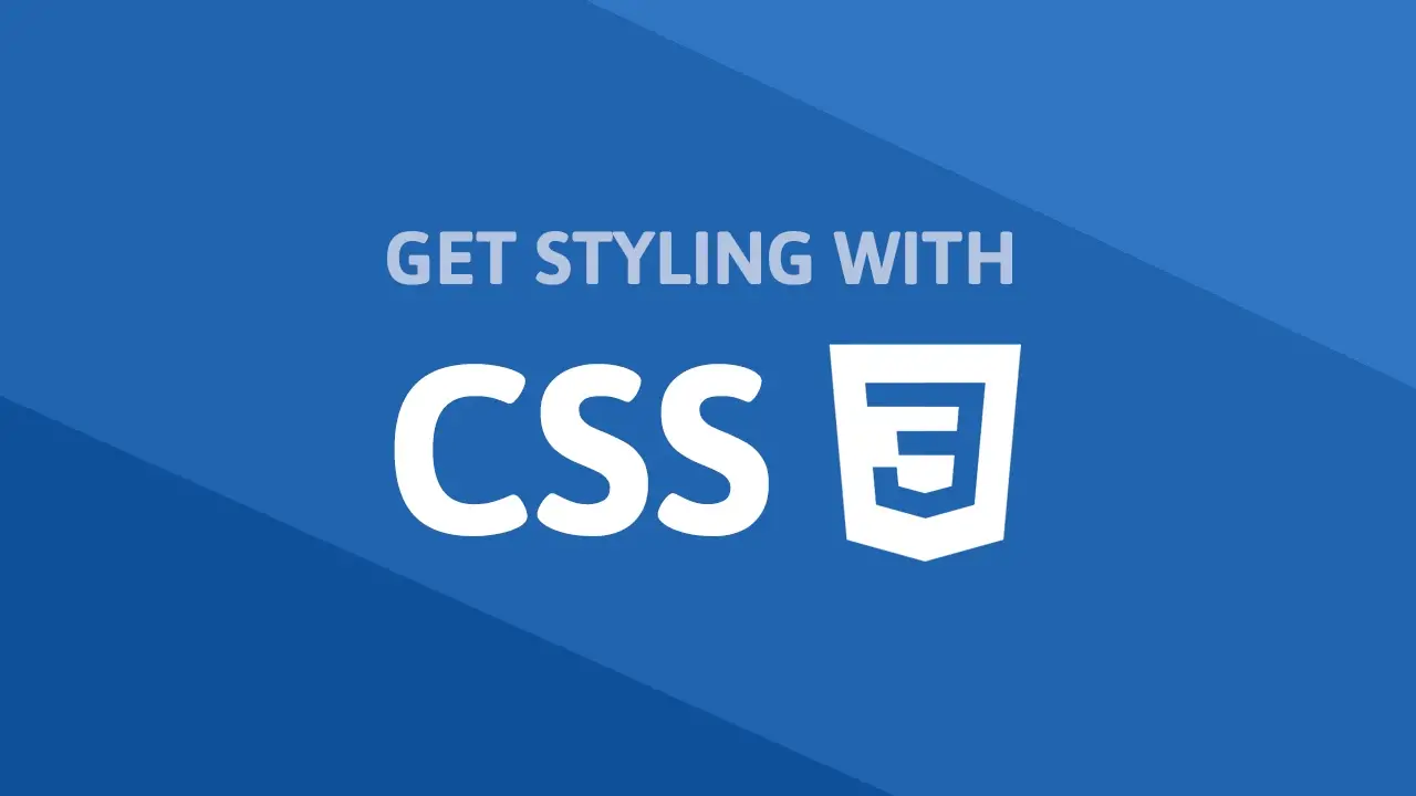
The most basic way to define a column layout is by applying a column-count property on a containing element. The value will be the number of columns you would like. For example, if you want to create a layout with 3 columns, you would use the following:
HTML<main class="columns">
    <p>(content here...)</p>
    <p>(content here...)</p>
    <p>(content here...)</p>
</main>
CSS.columns {
    column-count: 3;
}
- HTML
- CSS
 Using column count to set up columns.
It's really that simple. With just that single line of CSS, the browser can handle the rest for us and create the columns for us.
Column Width
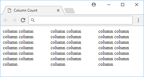
An alternative way to define columns is to provide a width for your columns with column-width. This allows the browser to determine how many columns it can display. With a larger screen, it can display more of them, and with a smaller screen, it can display less of them. Either way, you don't specify how many columns you want, only how wide you want each column to be.
HTML<main class="columns">
    <p>(content here...)</p>
    <p>(content here...)</p>
    <p>(content here...)</p>
</main>
CSS.columns {
    column-width: 6rem;
}
- HTML
- CSS
 Using column width to set up columns.
Column Gap
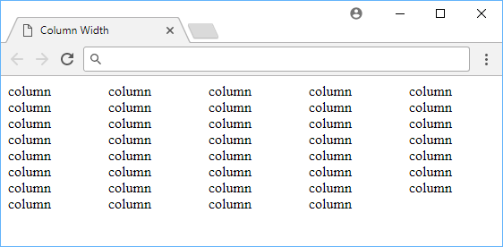
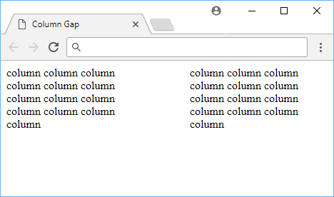
After you're happy with your columns, you can specify how wide you want the space between columns to be. You do this with the column-gap property, which takes a length as the value. The length can be a percentage or a length. For example, if you want a gap of 2rem between columns, you would use the following:
HTML<main class="columns">
    <p>(content here...)</p>
    <p>(content here...)</p>
</main>
CSS.columns {
    column-count: 2;
    column-gap: 2rem;
}
- HTML
- CSS
 Using 2rem column gap to add some space between our columns.
The image above shows how the 2 columns look like with a 2rem gap in between them, but look at how they look with a 4rem gap in between.
CSS.columns {
    column-count: 2;
    column-gap: 4rem;
}
 Using 4rem column gap to add even more space between our columns.
The difference is pretty noticeable!
Column Rule
In some cases, columns have a line (or rule) in between them to more clearly separate them. Other times, the line exists more for style and design. Either way, you can very easily define your own rule using column-rule, and it even uses the same values as as borders take.
HTML<main class="columns">
    <p>(content here...)</p>
    <p>(content here...)</p>
</main>
CSS.columns {
    column-count: 2;
    column-rule: 0.25rem double red;
}
- HTML
- CSS
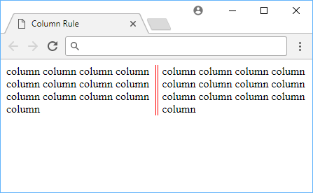 Using column rule to add a line separating our columns.
As a refresher, these are all the styles that the column rule can take:
soliddotteddasheddoubleinsetoutsetgrooveridge
Columns are a widely used layout most popular with print media and CSS gives us some very powerful properties for defining and utilizing columns ourselves.
Resources
 Getting Started with Solid
 Getting Started with Express
 Getting Started with Electron
 Best Visual Studio Code Extensions for 2022
 How to deploy a Deno app using Docker
 How to deploy a MySQL Server using Docker
 Learn how to use v-model with a custom Vue component
 How to Scrape the Web using Node.js and Puppeteer
 Getting Started with Handlebars.js
 Getting Started with Moment.js
 Getting Started with React
 Setting Up Stylus CSS Preprocessor