Table of Contents
For years, CSS has been infamous for the difficulty of designing a grid layout for a page. CSS Grid aims to fix this situation by offering a native grid layout system. With CSS Grid, you can easily and beautifully define a two-dimensional grid layout using less HTML and less styles. Before we get into learning how to use CSS Grid, there's some terminology that we should become familiar with.
Grid Lines
Grid lines are the lines that make up the grid. They divide up the entire area into rows and columns. The grid lines are not visible, but they are used to calculate the size of the cells.
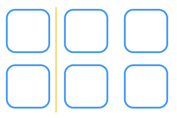 Diagram showing a Grid line.
Grid Cell
A grid cell is a single unit in the grid formed from the grid lines. Essentially, it just means one box. The grid cell is the smallest unit of the grid.
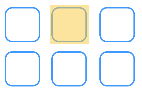 Diagram showing a Grid cell.
Grid Area
A grid area is the rectangular space formed between different horizontal and vertical grid lines.
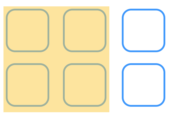 Diagram showing a Grid area.
Grid Row
A grid row is all the grid cells between two consecutive horizontal grid lines.
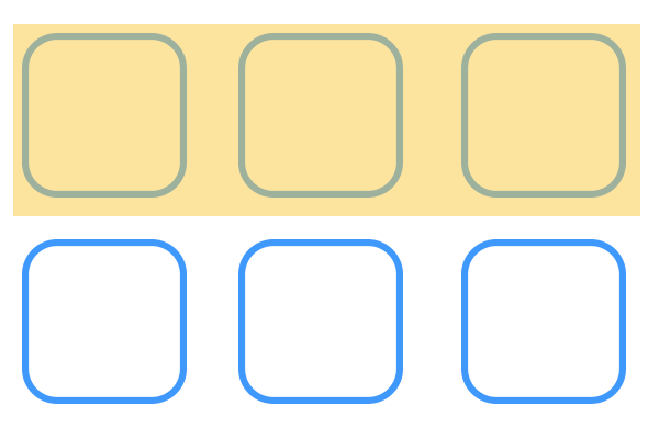 Diagram showing a Grid row.
Grid Column
A grid column is all the grid cells between two consecutive vertical grid lines.
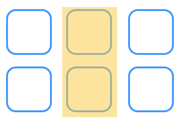 Diagram showing a Grid column.
Grid Gap
A grid gap is the gap of space between rows and columns. Alternatively, this is the space between grid cells.
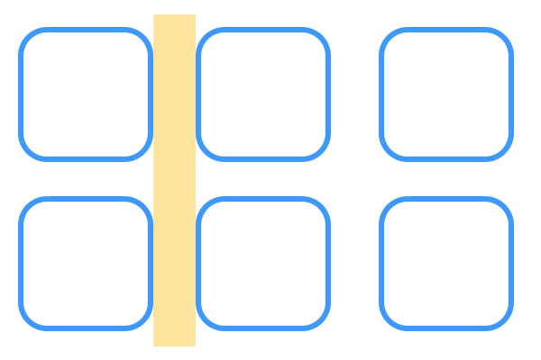 Diagram showing a Grid gap.
Use Grid
Now that we have the terminology down, let's get started on making our first CSS grid. For simplicity's sake, let's create a 3 by 2 grid. That is to say a grid with 3 columns and 2 rows. Let's start with the HTML:
HTML<div class="container">
    <div class="cell"></div>
    <div class="cell"></div>
    <div class="cell"></div>
    <div class="cell"></div>
    <div class="cell"></div>
    <div class="cell"></div>
</div>
To define a grid, we must use the display property with a value of grid:
CSS.container {
    display: grid;
}
The way to define rows and columns is using the grid-template-columns and grid-template-rows properties. What you provide as the value is the width or height of each of the rows and columns. Every value provided creates a new row or column. Let's say we wanted squares each 200px in length:
CSS.container {
    display: grid;
    grid-template-columns: 200px 200px 200px;
    grid-template-rows: 200px 200px;
}
Since we passed in three values for grid-template-columns, three columns were created, each 200px wide. We also passed in two values for grid-template-rows, each 200px tall.
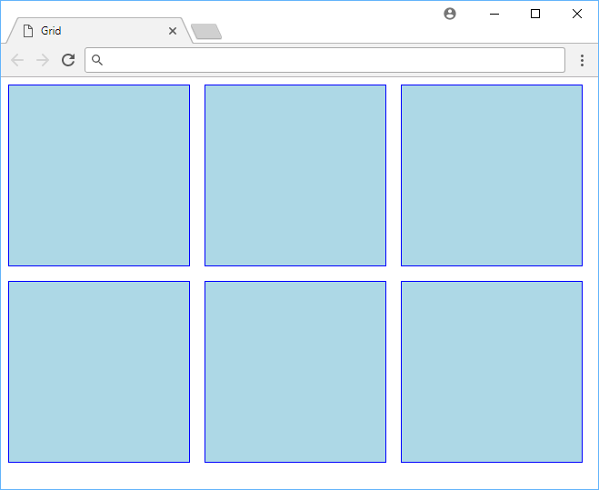
Here is our grid so far:
HTML<!DOCTYPE html>
<html>
    <head>
        <title>Grid</title>
        <style>
            .container {
                display: grid;
                grid-template-columns: 200px 200px 200px;
                grid-template-rows: 200px 200px;
            }
            .cell {
                background-color: lightblue;
                border: solid 1px blue;
            }
        </style>
    </head>
    <body>
        <div class="container">
            <div class="cell"></div>
            <div class="cell"></div>
            <div class="cell"></div>
            <div class="cell"></div>
            <div class="cell"></div>
            <div class="cell"></div>
        </div>
    </body>
</html>
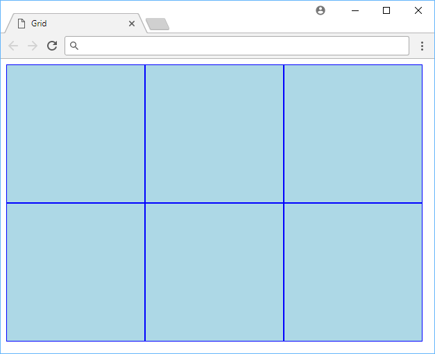 Our first CSS grid!
Grid Gap
Because we have yet to define a grid gap, all of the grid cells are touching one another. Let's fix that by defining a grid gap. This is done with the grid-gap property where the value is two lengths, one for the row and the other for the column. If you just pass in a single value, it will apply it to both the rows and columns.
CSS.container {
    display: grid;
    grid-template-columns: 200px 200px 200px;
    grid-template-rows: 200px 200px;
    grid-gap: 1rem;
}
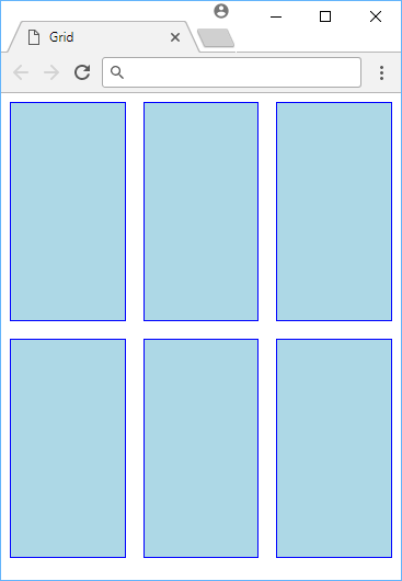
With the new grid gap, our grid now looks like this:
 A CSS grid with a grid gap.
FR (Fraction) Unit
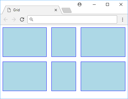
Along with CSS Grid comes a new unit specifically for this called fraction. The unit is used relative to how much space is left in the row or column. That means that 1fr takes up 100% of the remaining space. However, this is also relative to other cells, so if we set all our columns to 1fr the browser will just evenly divide up the space, giving us equally-spaced columns:
CSS.container {
    display: grid;
    grid-template-columns: 1fr 1fr 1fr;
    grid-template-rows: 200px 200px;
    grid-gap: 1rem;
}
 A CSS grid using the fr unit.
Because we gave each of our three columns a width of 1fr the browser divided up the remaining space by three. The row height, left untouched from before, simply remained the same at 200px.
As you might expect, you can even mix and match units and the browser will do the hard work for you. Let's say you wanted the first column to be 150px, the second column to take up 20% of whatever is left, and then the third column take whatever is left of that:
CSS.container {
    display: grid;
    grid-template-columns: 150px 20% 1fr;
    grid-template-rows: 100px 100px;
    grid-gap: 1rem;
}
 A CSS grid using mixed units.
Grid Start and End
So far our items have just been populated in the order they appear in our HTML, but we have the power to control that by defining at what lines an item starts and ends at. Before we go any further, let's look at a diagram that shows how CSS defines lines across rows and columns:
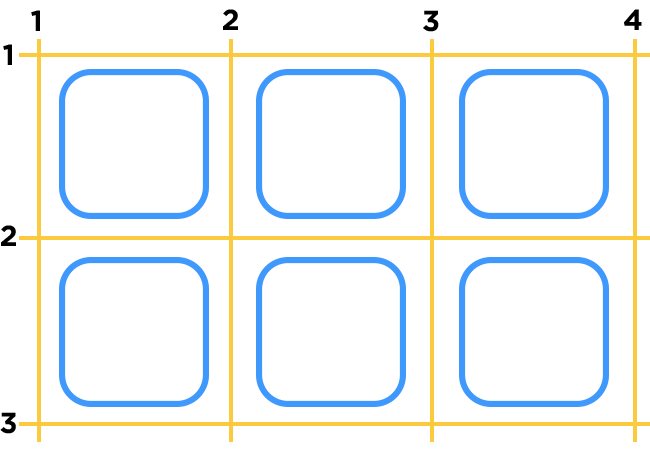 All the lines on a grid.
From the top-left corner, the lines start at 1 and move up as you go across and down. That means that the first cell in the diagram starts at row line 1 and ends at row line 2, and starts at column line 1 and ends at column line 2. As another example, the bottom-right-most cell starts at row line 2 and ends at row line 3, and starts at column line 3 and ends at column line 4.
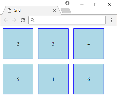
As you would expect, there are CSS properties to define this and they are called grid-row and grid-column. Let's see this in action by making the first element render in the the middle bottom spot:
HTML<div class="container">
    <div class="cell special">1</div>
    <div class="cell">2</div>
    <div class="cell">3</div>
    <div class="cell">4</div>
    <div class="cell">5</div>
    <div class="cell">6</div>
</div>
CSS.container {
    display: grid;
    grid-template-columns: 100px 100px 100px;
    grid-template-rows: 100px 100px;
    grid-gap: 1rem;
}

.cell {
    background-color: lightblue;
    border: solid 1px blue;
    line-height: 100px;
    text-align: center;
}

.special {
    grid-row: 2 / 3;
    grid-column: 2 / 3;
}
 Showing the use of grid-row and grid-column.
As expected, since we gave the first cell the special class which had grid-row and grid-column defined, it was placed in the spot we told it to be at, instead of at the top left position. The other cells then filled in the space in the order they would have normally.
Named Grid Lines
While it was easy enough to reference the grid lines on our grid, it might not be so straightforward on a bigger or more complex grid. Thankfully, CSS allows us to give the lines a name so that we can reference them that way instead of by their number. It makes the grid easier to comprehend and maintain.
For simplicity's sake, let's use the same example as before, putting the first cell in a new position, but do so with a named line instead:
HTML<div class="container">
    <div class="cell special">1</div>
    <div class="cell">2</div>
    <div class="cell">3</div>
    <div class="cell">4</div>
    <div class="cell">5</div>
    <div class="cell">6</div>
</div>
CSS.container {
    display: grid;
    grid-template-columns:
        [column-1] 100px
        [column-2] 100px
        [column-3] 100px
        [column-4];
    grid-template-rows:
        [row-1] 100px
        [row-2] 100px
        [row-3] 100px
        [row-4];
    grid-gap: 1rem;
}

.cell {
    background-color: lightblue;
    border: solid 1px blue;
    line-height: 100px;
    text-align: center;
}

.special {
    grid-row: row-2 / row-3;
    grid-column: column-2 / column-3;
}
 Moving an item using named lines.
While in this example we are still using numbers in their names, nothing stops you from renaming row-3 to peanut-butter if you wanted to. The point here is that you aren't forced to try and keep track of the row and column line numbers to build out your grid. You can just use named lines and the browser will figure out the rest.
Template Areas
An arguably easier way to define a grid layout and where items start and end is with the use of template areas. With template areas, you just tell the browser how to layout your grid using plain written language. You literally give the different cells in your grid a unique name and define where it belongs relative to the other cells.
Let's say you wanted a grid where the top and bottom boxes covered an entire row, but the middle row was split across two different columns:
HTML<div class="container">
    <div class="cell top">1</div>
    <div class="cell middle-1">2</div>
    <div class="cell middle-2">3</div>
    <div class="cell bottom">4</div>
</div>
CSS.container {
    display: grid;
    grid-template-columns: 100px 100px;
    grid-template-rows: 100px 100px;
    grid-gap: 1rem;
    grid-template-areas:
        "top 		top"
        "middle-1   middle-2"
        "bottom 	bottom";
}

.cell {
    background-color: lightblue;
    border: solid 1px blue;
    line-height: 100px;
    text-align: center;
}

.top {
    grid-area: top;
}

.middle-1 {
    grid-area: middle-1;
}

.middle-2 {
    grid-area: middle-2;
}

.bottom {
    grid-area: bottom;
}
 Showing the use of grid-template-areas.
- HTML
- CSS
No need to mess with numbers at all. You can define your grid inside the value of grid-template-areas, pass along the grid-area properties to the cells, and the browser takes care of the rest.
The magic is all in here:
CSSgrid-template-areas:
  "top 		top"
  "middle-1 middle-2 "
  "bottom 	bottom";
Conclusion
A CSS Grid is a powerful and native way to define all kinds of grid layouts, from the simplest and basic to the more complex and sophisticated. The cool part is that they can even be used in conjunction with flexible boxes for even more control over your page!
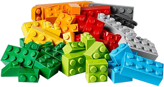 Now building grids is as easy as playing with Legos!
Resources
 Getting Started with TypeScript
 Create an RSS Reader in Node
 Best Visual Studio Code Extensions for 2022
 How to deploy a PHP app using Docker
 How to deploy a MySQL Server using Docker
 How to deploy an Express app using Docker
 Using Puppeteer and Jest for End-to-End Testing
 How to Scrape the Web using Node.js and Puppeteer
 Getting Started with Handlebars.js
 Building a Real-Time Note-Taking App with Vue and Firebase
 Setting Up Stylus CSS Preprocessor
 Getting Started with Moon.js