Table of Contents
Arguably one of the most difficult things to wrap your head around in CSS is how to properly layout elements on the page. In this lesson, we're going to break it down, and give concrete examples and techniques to help you layout your pages. We'll start with the basics, and then move on to more advanced techniques.
Two-column Page Layout
Let's say you wanted a two-column page, which tends to be pretty common. You can use flex for this.
Say this is your HTML:
HTML<h1>2 Columns</h1>
<div class="columns">
    <div>
        <h2>First Column</h2>
        <p>Has ea forensibus definiebas, vis iudicabit voluptatum ad. Amet praesent sea et. Minim petentium reprehendunt id per.</p>
    </div>
    <div>
        <h2>Second Column</h2>
        <p>Te habeo eripuit cum, vix ei quot noluisse maiestatis, ea solet eruditi percipit quo. Dicant iisque vel ei, ius id imperdiet inciderint accommodare.</p>
    </div>
</div>
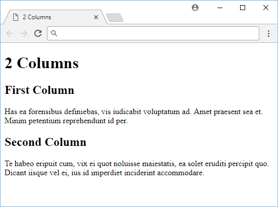 2 columns before applying flex.
To get the two columns we want, we need to give the parent element a display: flex and then give each column a flex: 1 so that they take up equal space.
CSS.columns {
    display: flex;
    flex-direction: row;
    justify-content: space-between;
}

.columns > div {
    flex: 1
}
When you apply these styles, you get this:
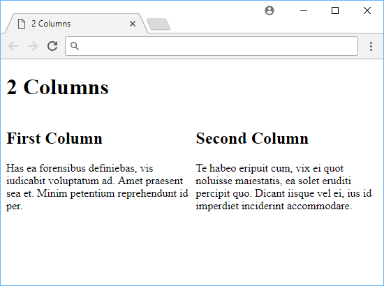 2 columns after using flex.
Sidebar Navigation Layout with Position
Creating a sidebar for navigation is also a pretty popular thing you see in websites. After all, why not? They're convenient and always right next to your content.
Let's tackle this using position this time.
HTML<!DOCTYPE html>
<html>
    <head>
        <title>Sidebar Navigation</title>
        <style>
            body, h1 {
                margin: 0;
            }

            .navigation {
                position: absolute;
                left: 0;
                width: 10rem;
                height: 100%;
                background-color: lightgray;
                text-align: center;
            }

            .navigation ul {
                padding: 0;
                list-style-type: none;
            }

            .navigation li {
                padding: 1rem;
            }

            .content {
                padding-top: 1rem;
                margin-left: 12rem;
            }
        </style>
    </head>
    <body>
        <nav class="navigation">
            <span>Logo Here</span>
            <ul>
                <li>Link #1</li>
                <li>Link #2</li>
                <li>Link #3</li>
            </ul>
        </nav>
        <div class="content">
            <h1>Content Title</h1>
            <div>
                <h2>First Paragraph</h2>
                <p>Has ea forensibus definiebas, vis iudicabit voluptatum ad. Amet praesent sea et. Minim petentium reprehendunt id per.</p>
            </div>
            <div>
                <h2>Second Paragraph</h2>
                <p>Te habeo eripuit cum, vix ei quot noluisse maiestatis, ea solet eruditi percipit quo. Dicant iisque vel ei, ius id imperdiet inciderint accommodare.</p>
            </div>
        </div>
    </body>
</html>
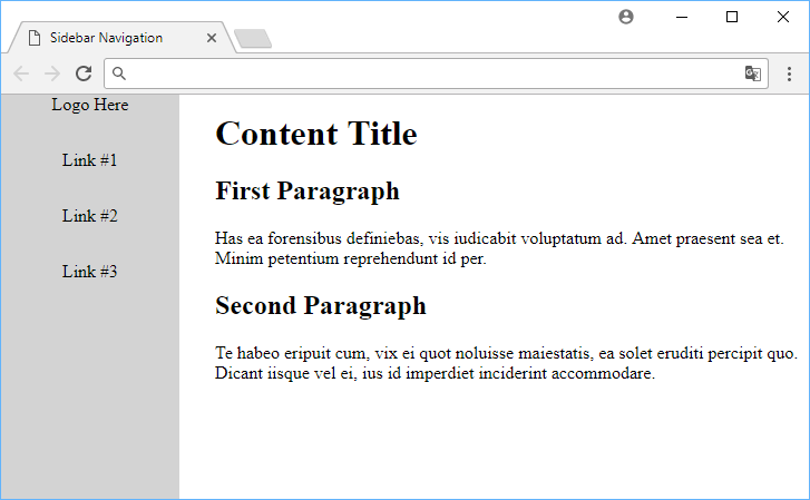 An example of sidebar navigation layout.
Our navigation element is being positioned absolute with a left value of 0. This makes our navigation links stay on the left side of the page. Also important to note that it was given a width of 10 rem.
Then, our content is given a margin-left of 12 rem. This makes it so that all the content is rendered to the right of navigation.
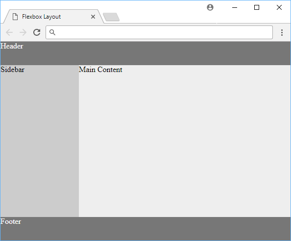
Flexbox Layout
Alternatively, you can accomplish a pretty similar layout to the one above by instead using a flexible box to layout the page:
HTML<!DOCTYPE html>
<html>
    <head>
        <title>Flexbox Layout</title>
        <style>
            body {
                margin: 0;
                min-height: 100vh;
                background: #ccc;
                display: flex;
                flex-direction: column;
            }

            .header, .footer {
                height: 3rem;
                background: #777;
                color: white;
            }

            .content {
                display: flex;
                flex: 1;
                background: #999;
                color: #000;
            }

            .main {
                flex: 1;
                background: #eee;
            }

            .sidebar {
                width: 10rem;
                background: #ccc;
            }
        </style>
    </head>
    <body>
        <header class="header">Header</header>
        <main class="content">
            <aside class="sidebar">Sidebar</aside>
            <section class="main">Main Content</section>
        </main>
        <footer class="footer">Footer</footer>
    </body>
</html>
 An example of using flex box for layout.
In this example, we make the page stretch vertically to take up the entire screen thanks to min-height: 100vh. Then, we stretch content and main so that the main content gets the remaining space that sidebar isn't using. By putting the header before and the footer after the content, the rest of the page renders just how we want it to.
Grid Layout
As we've seen in our lesson on CSS grids, grids were created for just this purpose of defining a layout for our page. Let's take a look at the same example as above done using CSS grids:
HTML<div class="container">
    <div class="header">Header</div>
    <div class="sidebar">Sidebar</div>
    <div class="content">Main Content</div>
    <div class="footer">Footer</div>
</div>
CSShtml, body, .container {
    width: 100%;
    height: 100%;
    margin: 0;
}

.container {
    display: grid;
    grid-template-columns: 12rem 1fr;
    grid-template-rows: 4rem 1fr 4rem;
    grid-template-areas:
        "header header"
        "sidebar content"
        "footer footer";
}

.header {
  grid-area: header;
  background-color: lightblue;
}

.sidebar {
  grid-area: sidebar;
  background-color: pink;
}

.content {
  grid-area: content;
  background-color: white;
}

.footer {
  grid-area: footer;
  background-color: lightgray;
}
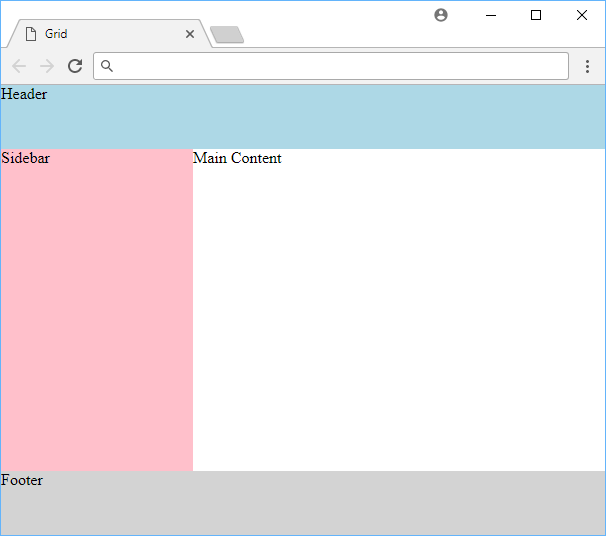 An example of using grid for layout.
Using grid-template-areas, it was relatively straightforward to divide up our page and then give each row and column the necessary width and height values via grid-template-columns and grid-template-rows. If you are still new to CSS grids, definitely refer back to this lesson for guidance!
Resources
 Getting Started with TypeScript
 How to Install Node on Windows, macOS and Linux
 Getting Started with Solid
 Best Visual Studio Code Extensions for 2022
 How to build a Discord bot using TypeScript
 How to deploy a PHP app using Docker
 How to deploy a Deno app using Docker
 Getting Started with Deno
 Getting Started with Handlebars.js
 Getting User Location using JavaScript's Geolocation API
 Getting Started with Moment.js
 Getting Started with Moon.js