Table of Contents
A pretty easy and fast way to add a bit of flavor to your pages is to give it a background of some kind. Whether that background is a color, an image, or a gradient, a background makes a big difference in how your website looks. The two main way to change the background of your website is to change the background color or background image. We'll cover both of these below.
Background Color
This is the easiest way to change your page's background color from the default white. You just pick a color with background-color and let the browser do the rest like this:
- CSS
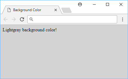 Example of background color.
You can replace light-gray with any color, and it will also work just fine. Examples of web safe colors include red, green, blue, yellow, purple, orange, pink, brown, black, white, and gray.
Background Image
When you want to use an image instead of color for your background, you can use the background-image property. This property takes a URL to an image, and the browser will use that image as the background.
Let's say you want this image as your background:
 A cute puppy.
The CSS might look like this:
CSSbody {
    background: url("puppy.png");
}
And your page like this:
 A cute puppy as your background image.
Background Image Repetition
For images where you might want to repeat it over and over again as the background, you can specify just that. The property for this is background-repeat and below are the valid values for this:
repeat: This repeats the image both on the x and the y-axis.repeat-x: This repeats the image on the y-axis.repeat-y: This repeats the image on the x-axis.no-repeat: This renders a single image without any repetition.
Background images can be repeated in any of the four directions, so you can use this to make a background image that repeats in both the x and y-axis.
Background Image Position
In case you don't want your background image to repeat, perhaps you then want to control where on the screen it will be rendered. By default, it will render from the top left corner, but you can specify otherwise using the background-position property. The property takes two values, the first is the x-axis and the second is the y-axis.
The main values for this property are left, top, right, bottom, and center, but you can also use lengths in the form of background-position: x y;.
Below are some valid values for background-position:
CSSbody {
    background-position: 40% 70%;
    background-position: right top;
    background-position: left center;
    background-position: right bottom;
    background-position: 2rem 5rem;
}
Background Image Size
Let's say you want to change the size of your background image. Use the background-size CSS property for this.
You are free to give it a new width and height to set the image to, like so:
CSSbody {
    background-size: 250px 300px;
    background-size: 70% 90%;
}
In the common case where you want the image to stretch and take up the entire window while respecting the image's ratio, you can use the cover value:
CSSbody {
    background-size: cover;
}
Gradients
When you don't want to use a solid color, using gradients is a simple way to use multiple colors on your page while allowing the browser to render all the colors in between.
Linear Gradients
The most simple of gradients are linear gradients. For example, here is a basic blue to purple gradient:
CSSbody {
    background: linear-gradient(blue, purple);
}
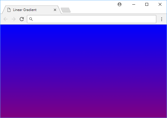 A blue to purple linear gradient.
- CSS
If you don't want your linear gradients to go from top to bottom, you can assign a direction value. If you give the property a degrees value, it will render it at that angle.
Here is how it looks like when you render at a 90-degree angle:
CSSbody {
    background: linear-gradient(90deg, blue, purple);
}
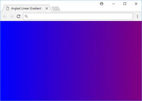 A blue to purple angled linear gradient.
- CSS
Radial Gradients
Gradients can also be used to create radial gradients. Radial gradients are similar to linear gradients, but instead of using two colors, you can use a single color and a radius. Radial gradients are rendered in the form of a circle. To demonstrate, here is a radial gradient using the same colors as before:
CSSbody {
    background: radial-gradient(blue, purple);
}
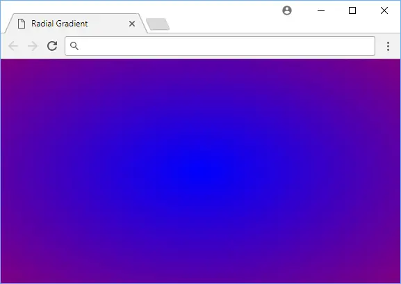 A blue to purple radial gradient.
- CSS
When done right, gradients can be a very tasteful way to spruce up your page! You can use the background-size property to control the size of the gradient and the background-position property to control where it is rendered.
Further Reading
 Getting Started with TypeScript
 Managing PHP Dependencies with Composer
 Create an RSS Reader in Node
 Getting Started with Electron
 How to deploy a PHP app using Docker
 Getting Started with Deno
 How to deploy a MySQL Server using Docker
 Getting Started with Sass
 Getting Started with Handlebars.js
 Build a Real-Time Chat App with Node, Express, and Socket.io
 Getting Started with Moment.js
 Using Push.js to Display Web Browser Notifications
