In this tutorial, we will learn how to use the v-model directive on a custom component by building a simple Vue component that acts like a checkbox. Using v-model on a custom component is useful because it lets you fully control how and when the data is updated. If you would like to see a demo before we begin, we have one right here!
Prerequisites
- Basic JavaScript knowledge is needed. If you need a refresher, check out our class on JavaScript.
- Basic Vue knowledge is also needed. If you need an introduction, check out our Introduction to Vue tutorial.
- Node and NPM installed. If you don't have them installed, follow our how to install Node guide.
How v-model works
Before we start, it is important to understand what v-model is actually doing. The directive is simply syntactic sugar that looks like this:
HTML<input v-model="name" />
But really functions like this:
HTML<input :value="name" @input="e => name = e.target.value" />
Which is still syntactic sugar for this:
HTML<input v-bind:value="name" v-on:input="e => name = e.target.value" />
What a difference! Using v-model, we can fully control when the value is emitted back up to the parent which is very powerful.
Creating a custom component
For the sake of this tutorial, I will assume you already have an entire Vue app already running and ready to go. Here's the parent component we will be working off of:
HTML<template>
    <div>Hello world!</div>
</template>

<script>
    export default {
        name: "App"
    }
</script>

<style lang="stylus">
</style>
Nothing fancy so far, we just have this:
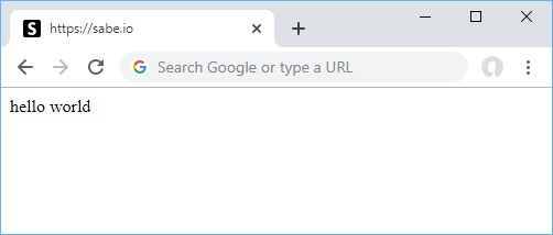 An empty Vue app.
Now let's start our iOS-themed custom component checkbox. Create a new file named Slider.vue, and put this in:
HTML<template>
    <input type="checkbox" :checked="value" @click="handleClick" />
</template>

<script>
    export default {
        name: "Slider",
        props: {
            value: {
                type: Boolean,
                required: true
            }
        },
        methods: {
            handleClick(event) {
                this.$emit("input", event.target.checked);
            }
        }
    }
</script>

<style lang="stylus">

</style>
Before we continue, let's break down what's happening here. The markup is our checkbox, whose value is set to the prop named value and with a click listener that runs the handleClick method. Inside that method is a call to emit the new checkbox value up to the parent component. At some point, the parent then passes in that new value back into the Slider component using props. Hopefully that made sense because this is very important to understand for the entire thing to make sense.
Also important to note is how powerful this really is:
JAVASCRIPThandleClick(event) {
    this.$emit("input", event.target.checked);
}
All we're doing is emitting back up the new checkbox value, but we didn't have to. We have full control to do whatever we want here including not emitting it at all or emitting an entirely different value in the case of something more complicated than a checkbox. Something like this would also be entirely valid:
JAVASCRIPThandleClick(event) {
    if (someCondition) {
        return;
    }
    this.$emit("input", event.target.checked);
}
If there is a reason why the checkbox shouldn't be clicked on, like for example if on a form the user first needs to enter in a name in a previous text field, this is a great pattern for blocking the use of this checkbox without needing to handle that in the parent component.
Now let's go back to the parent and add our new custom component.
Updating the parent component
Add our new custom component to the parent component, like so:
HTML<template>
    <div>
        <div>Hungry?</div>
        <Slider v-model="hungry" />
        <div>{{ hungry ? 'yes!' : 'no' }}</div>
    </div>
</template>

<script>
    import Slider from "./components/Slider";

    export default {
        name: "App",
        components: {
            Slider
        },
        data: () => ({
            hungry: true
        })
    };
</script>

<style>
</style>
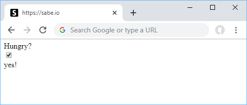 A look at our Vue app with our checkbox.
A couple things have happened here. We have imported our new Vue component, created a new hungry boolean to handle the state of our checkbox, and then a nice output to let us know in which state the boolean is in. In this case, it simply alternates text depending on whether or not you're hungry.
Tying it all together
Great so our custom Slider works, but it doesn't look great. Jony Ive would not approve of this. Let's add some styles to our slider.
HTML<template>
    <div class="slider" :class="{'slider--active': value}">
        <input type="checkbox" class="slider-checkbox" :checked="value" @click="handleClick" />
    </div>
</template>

<script>
    export default {
        name: "Slider",
        props: {
            value: {
                type: Boolean,
                required: true
            }
        },
        methods: {
            handleClick(event) {
                this.$emit("input", event.target.checked);
            }
        }
    }
</script>

<style lang="stylus">
    .slider {
        display: block;
        position: relative;
        min-height: 2rem;
        margin: 0.5rem 0;

        &:before,
        &:after {
            content: '';
            border-radius: 2rem;
            height: 1.5rem;
            display: block;
            position: absolute;
            top: 0;
        }

        &:before {
            transition: background-color 0.3s ease;
            background-color: rgba(0, 0, 0, 0.25);
            width: 2.75rem;
            left: 0rem;
        }

        &:after {
            background-color: white;
            width: 1.5rem;
            transition: 0.3s ease;
            transform: scale(0.8) translateX(0);
        }
    }

    .slider--active {

        &:before {
            background-color: #4ED164;
        }

        &:after {
            transform: scale(0.8) translateX(1.5rem);
        }
    }

    .slider-checkbox {
        margin: 0;
        position: absolute;
        width: 2.5rem;
        height: 1.5rem;
        z-index: 1;
        opacity: 0;
        cursor: pointer;
    }
</style>
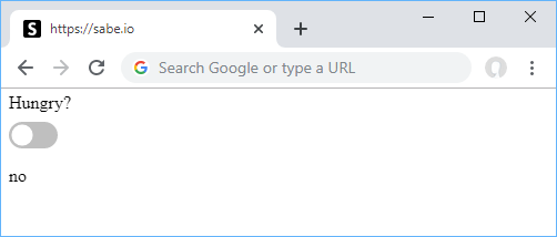 When you're not hungry.
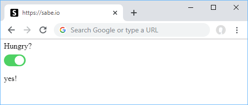 When you are hungry.
Conclusion
This tutorial was meant to be a very simple example of a custom component utilizing v-model. Remember that you can do this with any input type including text, passwords, dates, numbers. Don't forget to check out the demo of this tutorial if you would like to see this code in action immediately.
Resources

 Create an RSS Reader in Node
 Git Tutorial: Learn how to use Version Control
 How to Set Up Cron Jobs in Linux
 How to deploy a Deno app using Docker
 How to deploy an Express app using Docker
 How to Scrape the Web using Node.js and Puppeteer
 Creating a Twitter bot with Node.js
 Using Push.js to Display Web Browser Notifications
 Building a Real-Time Note-Taking App with Vue and Firebase
 Getting Started with React
 Setting Up a Local Web Server using Node.js
 How To Create a Modal Popup Box with CSS and JavaScript