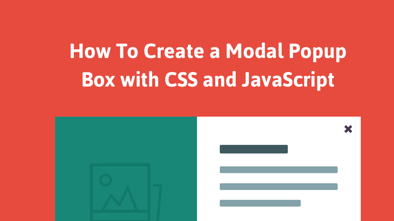
In this tutorial, we learn how to make a modal with CSS and JavaScript. Our goal is to create a lightweight and simple modal popup box that does not use any third-party libraries and is cross-browser compatible. We will be using vanilla JavaScript without jQuery. Because we will be building it from scratch, we will have full control over how it looks and functions.
Introduction
Modal popups are used pretty frequently on the web. Some popular uses of them include driving newsletter sign ups, displaying notifications/alerts, and handling register and login forms.
Our modal will be generic which means you will be free to use it for whatever purpose you'd like. Here's what they will look like once finished:
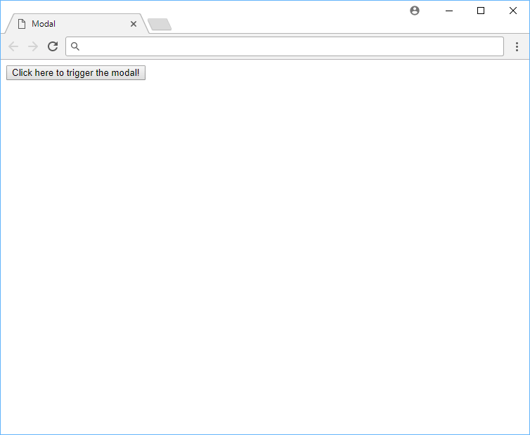 The modal before opening.
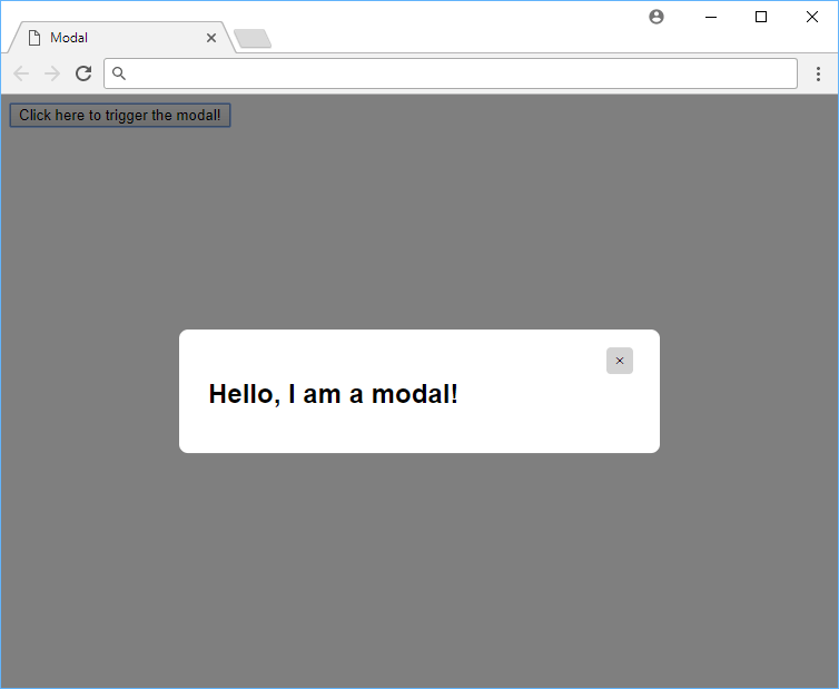 The modal after opening.
You can view a live demo of the finished product before continuing on. Now, let's get started on building this!
HTML Markup
Let's start with the HTML markup for the modal.
HTML<button class="trigger">Click here to trigger the modal!</button>
<div class="modal">
<div class="modal-content">
<span class="close-button">×</span>
<h1>Hello, I am a modal!</h1>
</div>
</div>
We have three different components here in the markup.
First, we have a simple button which, when clicked on, triggers the modal to open. Then we have the modal's parent container which houses the modal. Finally, we have the content that will go inside the modal, plus a close button.
To keep things simple, the only content inside the modal is an h1 tag with some text.
CSS Styles
These are the styles we will apply to make our modal look nice and pretty.
CSS.modal {
    position: fixed;
    left: 0;
    top: 0;
    width: 100%;
    height: 100%;
    background-color: rgba(0, 0, 0, 0.5);
    opacity: 0;
    visibility: hidden;
    transform: scale(1.1);
    transition: visibility 0s linear 0.25s, opacity 0.25s 0s, transform 0.25s;
}

.modal-content {
    position: absolute;
    top: 50%;
    left: 50%;
    transform: translate(-50%, -50%);
    background-color: white;
    padding: 1rem 1.5rem;
    width: 24rem;
    border-radius: 0.5rem;
}

.close-button {
    float: right;
    width: 1.5rem;
    line-height: 1.5rem;
    text-align: center;
    cursor: pointer;
    border-radius: 0.25rem;
    background-color: lightgray;
}

.close-button:hover {
    background-color: darkgray;
}

.show-modal {
    opacity: 1;
    visibility: visible;
    transform: scale(1.0);
    transition: visibility 0s linear 0s, opacity 0.25s 0s, transform 0.25s;
}
The styles here should be pretty simple, but here's a great class on CSS if you need a refresher.
Let's break down what we're doing.
CSS.modal {
    position: fixed;
    left: 0;
    top: 0;
    width: 100%;
    height: 100%;
    background-color: rgba(0, 0, 0, 0.5);
    opacity: 0;
    visibility: hidden;
    transform: scale(1.1);
}
The styles for the modal class makes it so that it creates a semi-transparent dark background color behind the modal when it is active. We stretch it to 100% width and height and set its visibility to hidden so that it doesn't appear before the user clicks the button.
CSS.modal-content {
    position: absolute;
    top: 50%;
    left: 50%;
    transform: translate(-50%, -50%);
    background-color: white;
    padding: 1rem 1.5rem;
    width: 24rem;
    border-radius: 0.5rem;
}
Then with the modal-content class, we position the actual modal in the center of the screen, with some visual goodies like a border-radius and some padding.
CSS.close-button {
    float: right;
    width: 1.5rem;
    line-height: 1.5rem;
    text-align: center;
    cursor: pointer;
    border-radius: 0.25rem;
    background-color: lightgray;
}

.close-button:hover {
    background-color: darkgray;
}
To allow us to close the modal in an elegant way, we have a close button that is just a nicely styled X button at the top-right corner of the modal. We also have a :hover state for the close button so that it changes color when the user hovers over it.
CSS.show-modal {
    opacity: 1;
    visibility: visible;
    transform: scale(1.0);
    transition: visibility 0s linear 0s, opacity 0.25s 0s, transform 0.25s;
}
Finally, we have our class that handles styling the modal when it is opened.
JavaScript Code
To make our modal popup actually work, we will be using a very tiny amount of pure, vanilla JavaScript. Again, we don't want to use any third-party libraries.
JAVASCRIPTconst modal = document.querySelector(".modal");
const trigger = document.querySelector(".trigger");
const closeButton = document.querySelector(".close-button");

function toggleModal() {
    modal.classList.toggle("show-modal");
}

function windowOnClick(event) {
    if (event.target === modal) {
        toggleModal();
    }
}

trigger.addEventListener("click", toggleModal);
closeButton.addEventListener("click", toggleModal);
window.addEventListener("click", windowOnClick);
We set three click listeners here:
- When the trigger is clicked, we want to show the modal.
- When the close button is clicked, we want to hide the modal.
- When the dark background is clicked, we want to also hide the modal.
Now if we were to press the trigger or the close button, the modal should smoothly animate between the states. It's all about the pretty animations. 😍
Again, you can click here for a live demo of what we created, or use the live editor below!
Conclusion
Modal boxes are universally popular and now you have an easy implementation to use for yourself that is light-weight and uses no third-party libraries like jQuery. You can use this modal for newsletters, sign-ups, or anything else you want! Hopefully you will enjoy the results and find it useful.
Happy coding and thanks for reading!
 Thumbs up!
 Getting Started with TypeScript
 Getting Started with Solid
 Managing PHP Dependencies with Composer
 Create an RSS Reader in Node
 Git Tutorial: Learn how to use Version Control
 How to Serve Static Files with Nginx and Docker
 How to Set Up Cron Jobs in Linux
 How to build a Discord bot using TypeScript
 Using Puppeteer and Jest for End-to-End Testing
 Build a Real-Time Chat App with Node, Express, and Socket.io
 Getting User Location using JavaScript's Geolocation API
 Setting Up Stylus CSS Preprocessor