Table of Contents
The flexible box layout (or flexbox) makes it easier to build a responsive and flexible layout for your page, something that has historically been either difficult or hacky in CSS. The layout is great for when you are not sure of the size of the items inside, hence the layout is flexible enough to handle dynamic sizes.
It gives the overall container the ability to adjust the size of the containing items to display them in the most efficient and readable way possible. The flexible box layout is a combination of the flexbox and grid layout.
Flex box layout
To create a flexible box layout, you need to use the flexbox property. Give a container a display: flex property.
CSS.container {
    display: flex;
}

.item {
    width: 5rem;
    height: 5rem;
    background-color: lightblue;
    border: solid 1px blue;
}
Inside, let's put three items:
HTML<div class="container">
    <div class="item">A</div>
    <div class="item">B</div>
    <div class="item">C</div>
    <div class="item">D</div>
</div>
Now we can apply any of the follow CSS properties to the parent element to determine how to display its children elements.
flex-directionflex-wrapflex-flowjustify-contentalign-itemsalign-content
Let's go over each property in detail and learn about each one's effect.
Flex Direction
Flex direction determines in what orientation and what direction the items inside will be placed. There are two options for the orientation, row or column, and two options for the direction, normal or reverse:
rowrow-reversecolumncolumn-reverse
Row
Using the same HTML and styles as above, here is how the items will render when we apply the different values for flex-direction:
CSS.container {
    display: flex;
    flex-direction: row;
}
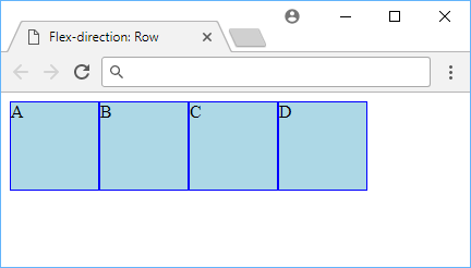 Flex Direction set to Row
Row Reverse
With row-reverse, the items, while still displayed in a row, are now being displayed in the reverse order as the HTML would suggest. This is useful when you want to display the items in a column, but you want to display them in the reverse order.
CSS.container {
    display: flex;
    flex-direction: row-reverse;
}
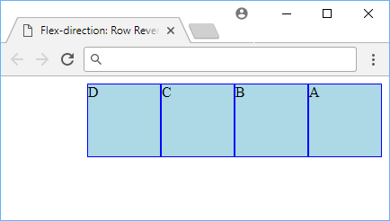 Flex Direction set to Row Reverse
Column
With a flex-direction of column, the items are lined up in a vertical column instead of a row.
CSS.container {
    display: flex;
    flex-direction: column;
}
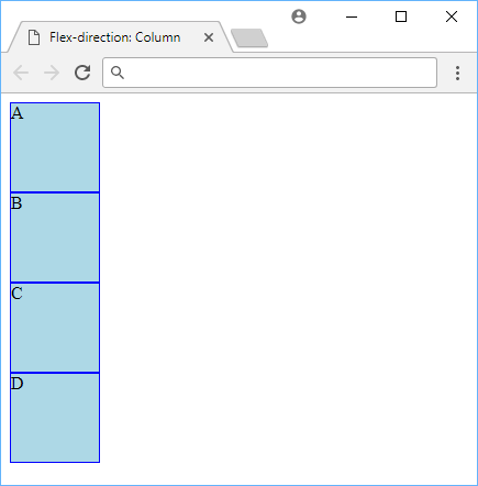 Flex Direction set to Column
Column Reverse
With a flex-direction of column-reverse, the items, still lined up in a vertical column, are placed in the reverse order as they appear in the HTML.
CSS.container {
    display: flex;
    flex-direction: column-reverse;
}
 Flex Direction set to Column Reverse
Flex Wrap
By default, the container will try to fit all the children items on the same line. You can change this behavior with flex-wrap. Below are the following values for it:
wrapno-wrapwrap-reverse
Wrap
CSS.container {
    display: flex;
    flex-wrap: wrap;
}
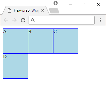 Flex Wrap set to Wrap
Since we set it to wrap, the last item, D, was rendered on the next line, wrapping when it couldn't fit at the end.
No-Wrap
CSS.container {
    display: flex;
    flex-wrap: no-wrap;
}
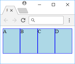 Flex Wrap set to No Wrap
To fit the items on one line and not wrap, the items were squeezed together.
Wrap Reverse
CSS.container {
    display: flex;
    flex-wrap: wrap-reverse;
}
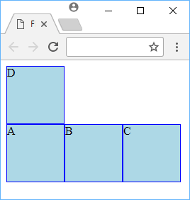 Flex Wrap set to Wrap Reverse
The items with wrap-reverse will wrap the items above instead of below the line.
Justify Content
The justify-content property defines the spacing around the items inside a flexible parent. There are six different ways to space out your items:
flex-startflex-endcenterspace-betweenspace-aroundspace-evenly
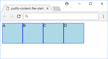
Flex Start
The justify-content value of flex-start starts the items at the beginning. This is the default value.
CSS.container {
    display: flex;
    justify-content: flex-start;
}
 Justify Content set to Flex Start
Flex End
The justify-content value of flex-end starts the items at the end.
CSS.container {
    display: flex;
    justify-content: flex-end;
}
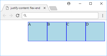 Justify Content set to Flex End
Center
The justify-content value of center centers the item in the space allocated.
CSS.container {
    display: flex;
    justify-content: center;
}
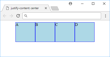 Justify Content set to Center
Space Between
The justify-content value of space-between ensures that the space between the items are equal.
CSS.container {
    display: flex;
    justify-content: space-between;
}
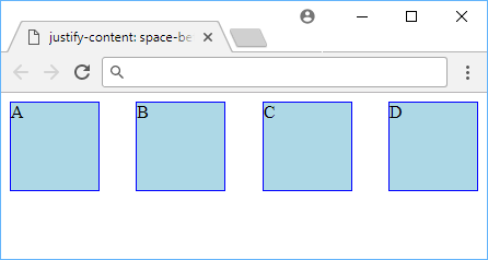 Justify Content set to Space Between
Space Around
The justify-content value of space-around ensures that the space around the items are equal. Notice that the first and last item have less space on the edges than between the items.
CSS.container {
    display: flex;
    justify-content: space-around;
}
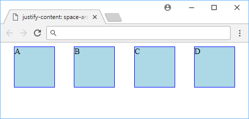 Justify Content set to Space Around
Space Evenly
The justify-content value of space-evenly ensures that the spacing between the edges and items are equal.
CSS.container {
    display: flex;
    justify-content: space-evenly;
}
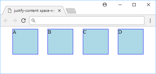 Justify Content set to Space Evenly
Align Items
The align-items property defines how the items are positioned within the row or column. It's similar to justify-content but perpendicular to the line it's being aligned on. To illustrate the following values, we'll use this HTML and CSS:
HTML<div class="container">
    <div class="item a">A</div>
    <div class="item b">B</div>
    <div class="item c">C</div>
    <div class="item d">D</div>
</div>
CSS.container {
    display: flex;
    align-items: stretch;
}

.item {
    width: 5rem;
    background-color: lightblue;
    border: solid 1px blue;
}

.a {
    height: 5rem;
}

.b {
    height: 3rem;
}

.c {
    height: 7rem;
}

.d {
    height: 10rem;
}
These are the valid values for align-items:
flex-startflex-endcenterstretchbaseline
Flex Start
The align-items value of flex-start makes it so that the items are aligned to the top (if a row) or to the left (if a column).
CSS.container {
    display: flex;
    align-items: flex-start;
}
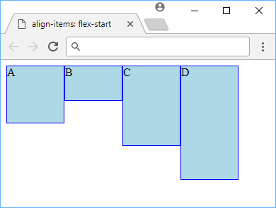 Align Items set to Flex Start
Flex End
The align-items value of flex-end makes it so that the items are aligned to the bottom (if a row) or to the right (if a column).
CSS.container {
    display: flex;
    align-items: flex-end;
}
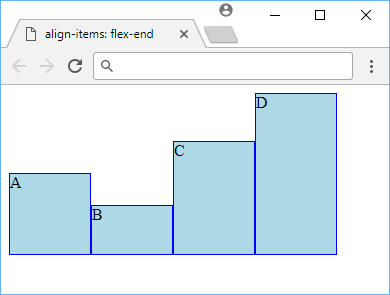 Align Items set to Flex End
Center
The align-items value of center aligns the item at the very center, vertically if it's a row or horizontally if it's a column.
CSS.container {
    display: flex;
    align-items: center;
}
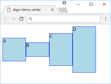 Align Items set to Center
Stretch
The align-items value of stretch will just make every element as tall (if a row) or wide (if a column) as the tallest/widest element. In our case, we manually set the heights of every box, but if we remove all the heights, we get this:
CSS.container {
    display: flex;
    align-items: stretch;
}
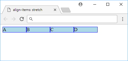 Align Items set to Stretch
Baseline
The align-items value of baseline aligns all the baselines of the items. Because the baselines are all the same because the content in them is just a single letter, they look aligned like flex-start in our example.
CSS.container {
    display: flex;
    align-items: baseline;
}
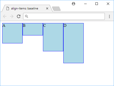 Align Items set to Baseline
Align Content
The align-content property defines the spacing between lines if they wrap. To properly demonstrate this property, we'll need more than 4 boxes, so let's do 12 boxes:
HTML<div class="container">
    <div class="item">A</div>
    <div class="item">B</div>
    <div class="item">C</div>
    <div class="item">D</div>
    <div class="item">E</div>
    <div class="item">F</div>
    <div class="item">G</div>
    <div class="item">H</div>
    <div class="item">I</div>
    <div class="item">J</div>
    <div class="item">K</div>
    <div class="item">L</div>
</div>
CSS.container {
    display: flex;
    flex-wrap: wrap;
    background-color: #ccc;
    height: 20rem;
    align-content: flex-start;
}

.item {
    width: 5rem;
    height: 5rem;
    background-color: lightblue;
    border: solid 1px blue;
}
These are the valid values for align-content:
flex-startflex-endcenterstretchspace-betweenspace-around
Flex Start
The align-content value of flex-start displays the lines the top (if it's a row) or the left (if it's a column).
CSS.container {
    display: flex;
    align-content: flex-start;
}
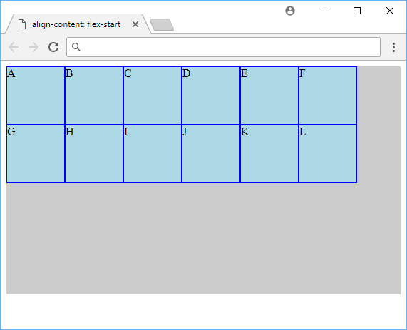 Align Content set to Flex Start
Flex End
The align-content value of flex-end displays the lines at the bottom (if it's a row) or to the left (if it's a column).
CSS.container {
    display: flex;
    align-content: flex-end;
}
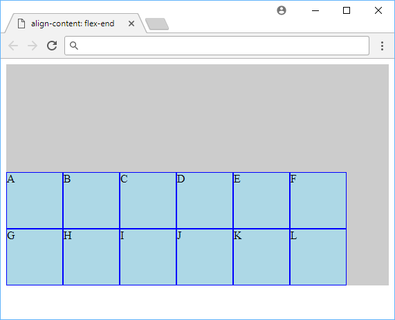 Align Content set to Flex End
Center
The align-content value of center puts the lines in the center of the row or column.
CSS.container {
    display: flex;
    align-content: center;
}
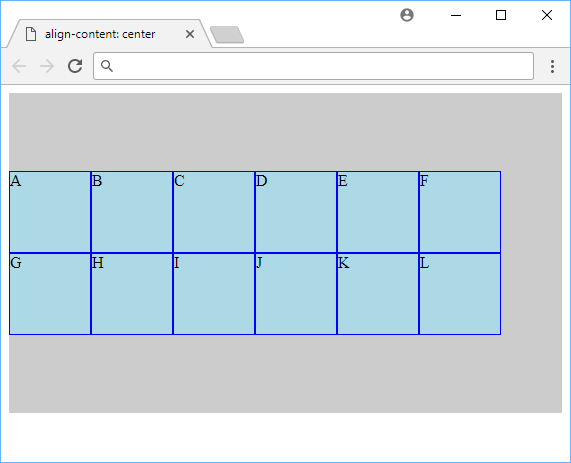 Align Content set to Center
Stretch
The align-content value of stretch is the default value, which stretch the lines to take up any remaining space.
CSS.container {
    display: flex;
    align-content: stretch;
}
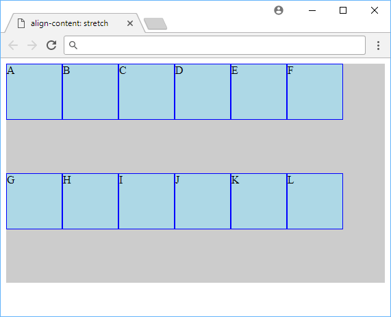 Align Content set to Stretch
Space Between
The align-content value of space-between ensures that lines are evenly distributed with regards to space in between.
CSS.container {
    display: flex;
    align-content: space-between;
}
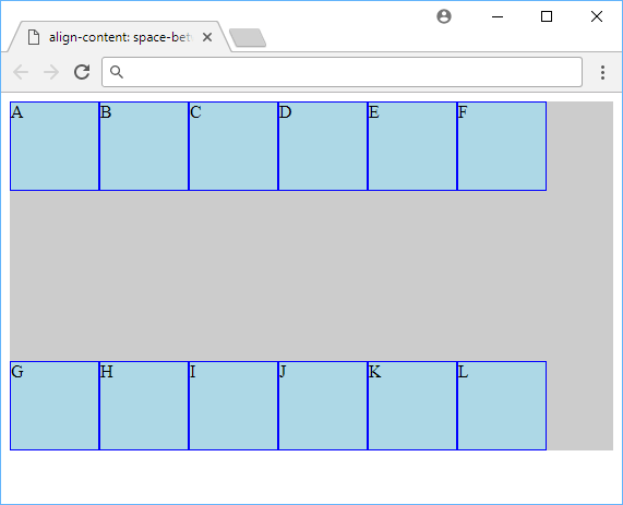 Align Content set to Space Between
Space Around
The align-content value of space-around makes it so that there is even space around each line.
CSS.container {
    display: flex;
    align-content: space-around;
}
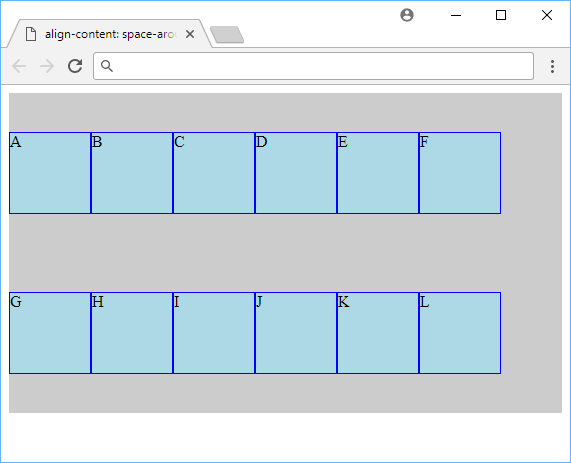 Align Content set to Space Around
Order
The order CSS property allows us the ability to change the order in which things are rendered without needing to change the HTML for it.
Every item's default order is 0 and so they will just be rendered in the order that they appear. However, consider this scenario:
HTML<div class="container">
    <div class="item a">A</div>
    <div class="item">B</div>
    <div class="item">C</div>
    <div class="item">D</div>
    <div class="item">E</div>
</div>
CSS.container {
    display: flex;
}

.item {
    width: 5rem;
    height: 5rem;
    background-color: lightblue;
    border: solid 1px blue;
}

.a {
    order: 1;
}
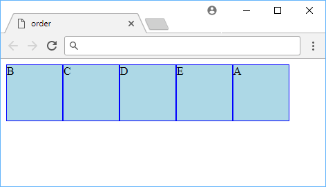 A look at using Order with Flexbox.
Because A has an order of 1, it got rendered last, since 1 is greater than 0. Items are rendered in numerical order, and you are allowed negative numbers if you'd like. This is a powerful way to precisely control the order of items inside your row or column.
Flex Grow
The flex-grow property defines how items in a row or column grow relative to each other. By default, the value is 0, which basically means that the items themselves determine their own width. By setting every item to a flex-grow of 1, every item will take up the same amount of space since they are equal, relative to one another.
However, watch what happens when we give 1 item a flex-grow of 2, while leaving the rest at a flex-grow of 1:
HTML<div class="container">
    <div class="item">A</div>
    <div class="item">B</div>
    <div class="item double">C</div>
    <div class="item">D</div>
    <div class="item">E</div>
</div>
CSS.container {
    display: flex;
}

.item {
    background-color: lightblue;
    border: solid 1px blue;
    height: 5rem;
    flex-grow: 1;
}

.double {
    flex-grow: 2;
}
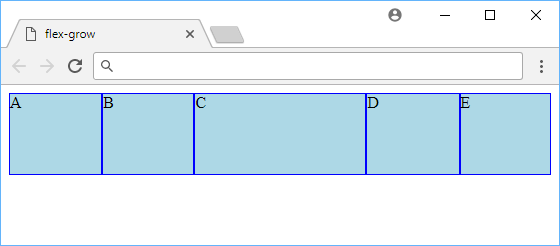 Using flex-grow to double a box's width.
As you would expect, the middle box, with it's flex-grow of 2, maintained twice as large of a width as the other boxes. If you resized your browser, it would remain twice as large.
flex-grow is an awesome way to control the sizes of the items relative to one another to ensure that each item is given the space they need.
Flex Shrink
The opposite of flex-grow is flex-shrink. As you would imagine, this property controls how an item will shrink relative to other items. The default value is 1 and the bigger the value, the faster it will shrink.
Let's have one box have a flex-shrink of 0 and another with 2:
HTML<div class="container">
    <div class="item">A</div>
    <div class="item b">B</div>
    <div class="item">C</div>
    <div class="item d">D</div>
    <div class="item">E</div>
</div>
CSS.container {
    display: flex;
}

.item {
    background-color: lightblue;
    border: solid 1px blue;
    height: 5rem;
    width: 10rem;
}

.b {
    flex-shrink: 0;
}

.d {
    flex-shrink: 2;
}
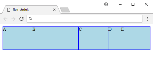 Using flex-shrink to change how fast an item shrinks.
The box with the letter B in it shrunk slower than the rest because it had a smaller value for flex-shrink, whereas the box with the letter D in it shrunk faster because it had a larger value for flex-shrink.
Flex Basis
The flex-basis CSS property is the flex way of defining an element's width or height. Remember that you can have a row or a column. With flex-basis it will apply the length provided as a width if in a row, or a height if in a column. There is otherwise no difference between flex-basis and width or height.
Let's show the use of flex-basis in this simple example:
HTML<div class="container">
    <div class="item">A</div>
    <div class="item">B</div>
    <div class="item flex-basis">C</div>
    <div class="item">D</div>
    <div class="item">E</div>
</div>
CSS.container {
    display: flex;
}
.item {
    background-color: lightblue;
    border: solid 1px blue;
    height: 5rem;
    width: 5rem;
}
.flex-basis {
    flex-basis: 10rem;
}
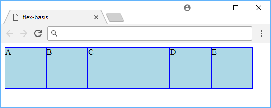 Using flex-basis to give an item in a row a width.
Align Self
The align-self property allows individual flex items to override the alignment specified by align-items. For example, you could have an instance where every item is aligned with flex-end but one item is aligned center:
HTML<div class="container">
    <div class="item">A</div>
    <div class="item">B</div>
    <div class="item center">C</div>
    <div class="item">D</div>
    <div class="item">E</div>
</div>
CSS.container {
    display: flex;
    background-color: #ddd;
    height: 20rem;
    align-items: flex-end;
}
.item {
    background-color: lightblue;
    border: solid 1px blue;
    height: 5rem;
    width: 5rem;
}
.center {
    align-self: center;
}
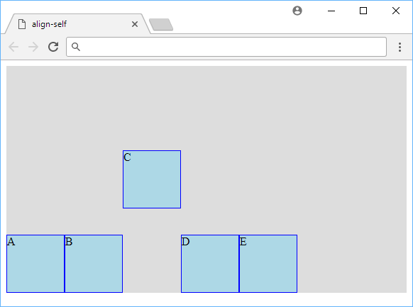 Using align-self to give an item it's own align-items value.
We let the box with the letter C in it align itself center whereas the rest of the items were aligned flex-end. This technique allows individual flex items to behave and render differently from the rest of the items.
Resources
 Getting Started with TypeScript
 Getting Started with Svelte
 How to deploy a .NET app using Docker
 How to deploy a Deno app using Docker
 How to deploy an Express app using Docker
 How to deploy a Node app using Docker
 Getting Started with Sass
 Using Puppeteer and Jest for End-to-End Testing
 How to Scrape the Web using Node.js and Puppeteer
 Build a Real-Time Chat App with Node, Express, and Socket.io
 Getting Started with React
 Getting Started with Vuex: Managing State in Vue