Transitions
Transitions in CSS allow you to easily animate elements by changing properties and letting the browser calculate the values in between. Specifying a transition effect is extremely easy using the transition property.
In our first example, let's create a blank page that when hovered will smoothly animate to a black background:
HTML<!DOCTYPE html>
<html>
    <head>
        <title>Transitions</title>
        <style>
            body {
                transition: 1s;
                height: 100vh;
                margin: 0;
            }

            body:hover {
                background-color: black;
            }
        </style>
    </head>
    <body>

    </body>
</html>
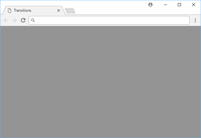 About halfway animating between white and black.
- CSS
That's pretty much it for this effect. The browser animated between white (#FFFFFF) and black (#000000) over a duration of 1 second. Because we didn't specify a transition property, the browser will use the default transition effect of all 0.5s ease-in-out. That means that all properties will transition smoothly from one value to the other when they are changed.
Transition Property
In our example, since we didn't give the browser any specific property to transition, it will transition all properties that are capable of being transitioned.
In most cases, we only want certain properties to transition. To accomplish this, just add the property you want transitioned alongside your duration:
HTML<!DOCTYPE html>
<html>
    <head>
        <title>Transition Property</title>
        <style>
            .box {
                transition: height 1s;
                height: 5rem;
                width: 10rem;
                background-color: red;
            }

            .box:hover {
                height: 10rem;
                background-color: blue;
            }
        </style>
    </head>
    <body>
        <div class="box"></div>
    </body>
</html>
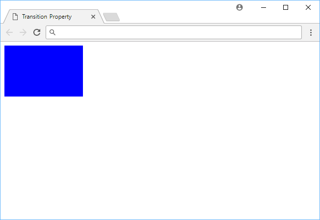 Transitioning on a specific property.
- HTML
- CSS
In this example we have a box with a set width, height, and background-color, while it has a new value for height and background-color upon hover.
Because we set transition to only occur on height value changes, the box will immediately turn blue on hover, but it will animate its height change.
If you made it transition only on background-color instead, you would have a smooth transition from red to blue, while the change in height would be instant.
Transition Timing Function
Did you notice that in both examples above, the transitions were smooth? Going from black to white felt smooth, and so did the height change on the box.
This is thanks to the timing function. Rather than just going from value A to value B in a constant acceleration, the browser applies an acceleration curve.
If you want to see the effect without this curve, give it the linear value, which will ensure the values transition at a constant rate.
CSStransition: height 1s linear;
The browser uses ease by default, which is what gives it that smoothness, but you have many options at your disposal:
ease: Starts off slow, speeds up sharply, slows down at the end. (default)linear: Goes from0%to100%linearly.ease-in: Starts off slow and continues to speed up until the end.ease-out: Starts off fast but slows down at the end.ease-in-out: Starts off slow, speeds up smoothly, slows down at the end.
Transition Delay
As a final bit of customization for your transitions, you can specify a delay on them. A delay is simply the amount of time you want to elapse before beginning the transition.
Let's say you wanted to delay a transition by 250 milliseconds, the styles would look like this:
CSStransition: height 1s linear 250ms;
- HTML
- CSS
 Getting Started with TypeScript
 Managing PHP Dependencies with Composer
 Getting Started with Svelte
 How to Serve Static Files with Nginx and Docker
 How to build a Discord bot using TypeScript
 How to deploy a PHP app using Docker
 How to deploy a Deno app using Docker
 How to deploy a Node app using Docker
 Getting Started with Handlebars.js
 Using Push.js to Display Web Browser Notifications
 Getting Started with React
 Setting Up Stylus CSS Preprocessor