Table of Contents
CSS allows you to perform many of the same transforms possible in 2D space in 3D space. The unifying property for 3D transforms is perspective.
What is Perspective?
You can think of the perspective as essentially the angle that you look at the element. Without any perspective, elements are viewed by default in 2D, straight-on.
You can apply perspective two different ways, by the perspective property which can be applied on a parent element to affect the children, or on the children themselves using the perspective function.
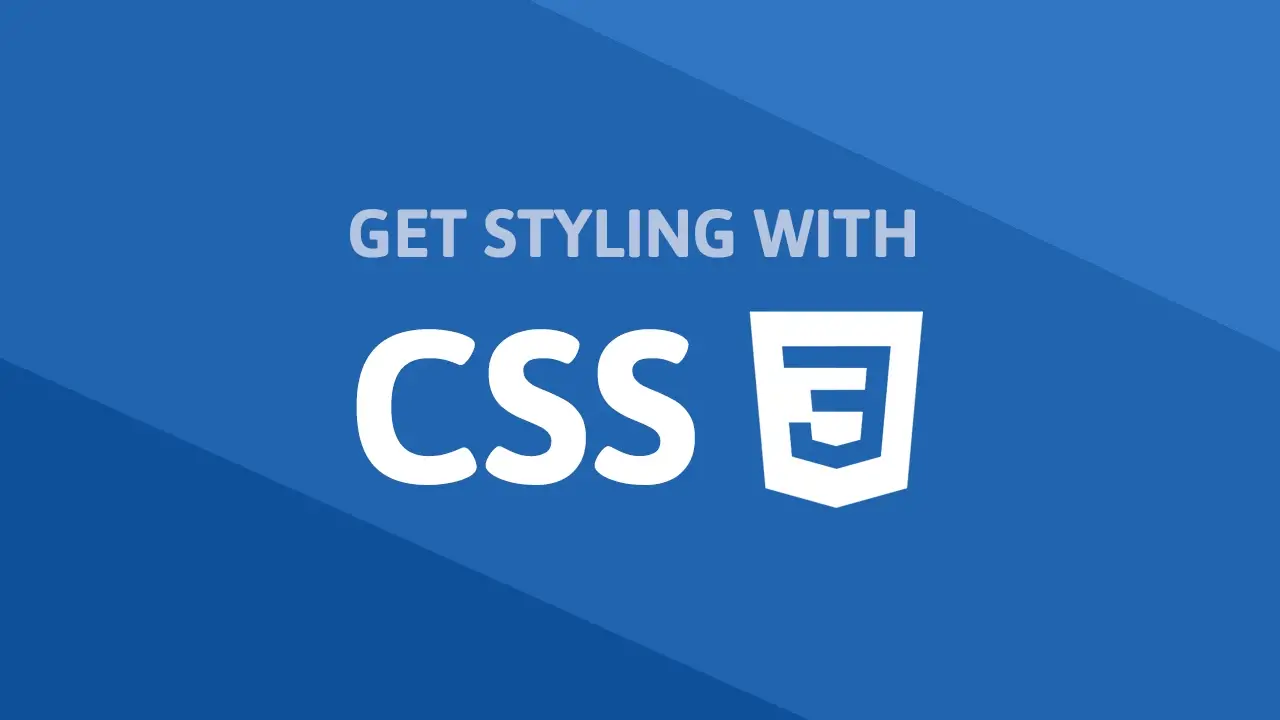
Perspective Property
To use the perspective property, just give it a length, which represents how far children elements are placed from the view. The larger the value, the further away it is.
Let's try it with 400px.
HTML<!DOCTYPE html>
<html>
    <head>
        <title>Perspective: Property</title>
        <style>
            .parent {
                perspective: 400px;
            }

            .box {
                width: 5rem;
                height: 5rem;
                margin: 4rem;
                background-color: red;
                transform: rotateX(45deg);
            }
        </style>
    </head>
    <body>
        <div class="parent">
            <div class="box"></div>
            <div class="box"></div>
            <div class="box"></div>
        </div>
    </body>
</html>
 Using the perspective property on the parent element.
CSSperspective: length;
By applying perspective on the parent element, it affects how all the children are rendered, in this case, the three boxes.
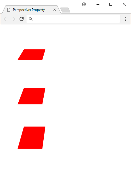
Perspective Function
The other way to apply perspective is using the perspective function. This will apply it to just the element itself. This is useful for applying perspective to an element that has a lot of children.
HTML<!DOCTYPE html>
<html>
    <head>
        <title>Perspective: Function</title>
        <style>
            .box {
                width: 5rem;
                height: 5rem;
                margin: 4rem;
                background-color: red;
            }

            .box-1 {
                transform: perspective(100px) rotateX(50deg);
            }

            .box-2 {
                transform: perspective(200px) rotateX(50deg);
            }

            .box-3 {
                transform: perspective(300px) rotateX(50deg);
            }
        </style>
    </head>
    <body>
        <div class="box box-1"></div>
        <div class="box box-2"></div>
        <div class="box box-3"></div>
    </body>
</html>
 Using the perspective function on the children.
CSStransform: perspective(length);
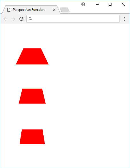
Perspective Origin
Just like you can set an origin for your 2D transforms using transform-origin, you can set an origin for your 3D transforms using perspective-origin.
The initial value is 50% 50% for the X and Y, but it takes any length value.
HTML<!DOCTYPE html>
<html>
    <head>
        <title>Perspective: Origin</title>
        <style>
            .outer-box {
                perspective: 150px;
            }

            .outer-box-1 {
                perspective-origin: 0 0;
            }

            .outer-box-2 {
                perspective-origin: 60% 60%;
            }

            .outer-box-3 {
                perspective-origin: 150px 150px;
            }

            .inner-box {
                width: 5rem;
                height: 5rem;
                margin: 4rem;
                background-color: red;
                transform: rotateX(45deg);
            }
        </style>
    </head>
    <body>
        <div class="outer-box outer-box-1">
            <div class="inner-box"></div>
        </div>
        <div class="outer-box outer-box-2">
            <div class="inner-box"></div>
        </div>
        <div class="outer-box outer-box-3">
            <div class="inner-box"></div>
        </div>
    </body>
</html>
 Example of using perspective origin.
CSSperspective-origin: length1 length2;
3D Translate
Translating an element in 3D instead of 2D allows you to change an element's value on the Z axis. This is useful for creating a 3D effect.
You can think of the Z axis as a line aimed directly at you, where the higher the number, the closer it will appear to you.
HTML<!DOCTYPE html>
<html>
    <head>
        <title>Transform: 3D Translate</title>
        <style>
            .box {
                width: 5rem;
                height: 5rem;
                margin: 4rem;
                background-color: red;
            }

            .box-1 {
                transform: perspective(250px) translateZ(75px);
            }

            .box-2 {
                transform: perspective(250px) translateZ(-75px);
            }
        </style>
    </head>
    <body>
        <div class="box box-1"></div>
        <div class="box box-2"></div>
    </body>
</html>
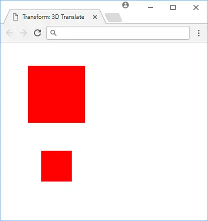 Using 3D translate to translate boxes by the Z axis.
CSStransform: translateX(x);
transform: translateY(y);
transform: translateZ(z);
3D Rotate
Unlike 2D rotations where you could only control the angle, with 3D rotations you can control the X, Y, and the Z axis.
This transform is best demonstrated instead of explained.
HTML<!DOCTYPE html>
<html>
    <head>
        <title>Transform: 3D Rotate</title>
        <style>
            .box {
                width: 5rem;
                height: 5rem;
                margin: 4rem;
                background-color: red;
            }

            .box-1 {
                transform: perspective(250px) rotateX(30deg);
            }

            .box-2 {
                transform: perspective(250px) rotateY(30deg);
            }

            .box-3 {
                transform: perspective(250px) rotateZ(30deg);
            }
        </style>
    </head>
    <body>
        <div class="box box-1"></div>
        <div class="box box-2"></div>
        <div class="box box-3"></div>
    </body>
</html>
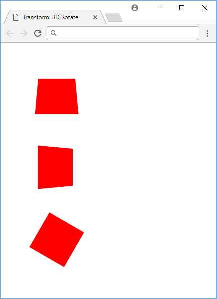 Using 3D rotate to rotate boxes by the X, Y, and Z axis.
CSStransform: rotateX(x);
transform: rotateY(y);
transform: rotateZ(z);
3D Scale
Scaling in 3D introduces the scaleZ function. The only problem is that to easily see the effect in action, we need to apply another transform, like a bit of rotation.
HTML<!DOCTYPE html>
<html>
    <head>
        <title>Transform: 3D Scale</title>
        <style>
            .box {
                width: 5rem;
                height: 5rem;
                margin: 4rem;
                background-color: red;
            }

            .box-1 {
                transform: perspective(250px) scaleZ(2) rotateX(40deg);
            }

            .box-2 {
                transform: perspective(250px) scaleZ(0.5) rotateX(40deg);
            }
        </style>
    </head>
    <body>
        <div class="box box-1"></div>
        <div class="box box-2"></div>
    </body>
</html>
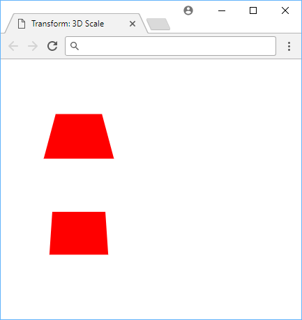 Using 3D scale to scale boxes in 3D.
CSStransform: scaleX(x);
transform: scaleY(y);
transform: scaleZ(z);
Transforms in 3D take a bit of practice. Sometimes, it is difficult to wrap your head around what is going on, but it gets easier the more you play around with it. Use it to create fun and interesting visuals.
Resources
 Getting Started with TypeScript
 Getting Started with Solid
 Managing PHP Dependencies with Composer
 Getting Started with Express
 Git Tutorial: Learn how to use Version Control
 How to Serve Static Files with Nginx and Docker
 How to deploy a Deno app using Docker
 Getting Started with Handlebars.js
 Getting Started with Moment.js
 Creating a Twitter bot with Node.js
 Building a Real-Time Note-Taking App with Vue and Firebase
 Setting Up a Local Web Server using Node.js