Table of Contents
CSS animations allow you to animate the transition between CSS properties. The awesome thing about CSS animations is that they don't require any JavaScript and it allows the browser to control the animation, meaning their performance can be improved over time as opposed to if the animation was written in JavaScript.
 An example animation.
Animation Keyframes
The first step in creating a new animation is to first define your animation keyframes. A keyframe is the state of the animation at a certain point in time. After you define a few keyframes, you can then let the browser animate the states between them.
A full keyframes definition is composed of three distinct parts:
- Name: The name of the animation.
- Keyframe: The moment in time as a percentage of the entire animation.
- CSS Properties: The CSS properties and values to apply.
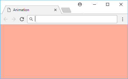
Let's say you wanted an animation that turns a page's background color from white to pink then to lightsalmon, and we called this animation fire:
CSS@keyframes fire {
    0% {
        background-color: white;
    }
    50% {
        background-color: pink;
    }
    100% {
        background-color: lightsalmon;
    }
}
At 0% since the animation has not yet started, we have the initial state to a background color of white. Halfway through the animation, at 50%, we set the background color to pink. Finally, at the end of the animation, at 100%, we set the background color to lightsalmon.
In between those states, however, the browser is doing the heavy lifting and calculating the color values in between to ensure the animation is silky smooth.
Animation Name and Duration
Now that we've defined our keyframes and given our animation a name, now we must simply apply it to an element. We do this by telling an element what animation to use via animation-name. In our example, it would be fire.
After specifying which animation the element should use, you will also need to define a duration for the animation. After all, we told our browser that we want a background color of lightred at 50%, but 50% of what?
We define the duration of the animation using animation-duration.
Let's say we want to apply fire to body and have the entire animation last for 3 seconds:
CSS.animation {
    animation-name: fire;
    animation-duration: 3s;
}
Try this out yourself with this fully-working example:
 Our fire animation 🔥🔥🔥.
While an animation name and duration is required, there are multiple additional optional animation properties that you can use to customize your animation:
animation-delayanimation-iteration-countanimation-directionanimation-timing-functionanimation-fill-modeanimation-play-state
Let's go over each one.
Animation Delay
The animation-delay property defines how long to wait after the element has loaded to begin the animation. It takes a time value, seconds (s) or milliseconds (ms).
To start an animation 2 seconds later:
CSS.animation {
    animation-name: fire;
    animation-duration: 3s;
    animation-delay: 2s;
}
Or to start an animation 1,000 milliseconds into the animation, use a negative value:
CSS.animation {
    animation-name: fire;
    animation-duration: 3s;
    animation-delay: -1000ms;
}
Fully-working example:
HTML<!DOCTYPE html>
<html>
    <head>
        <title>Animation Delay</title>
        <style>
            body {
                display: flex;
                justify-content: space-between;
            }

            .box {
                width: 5rem;
                height: 5rem;
                animation-name: pulsate;
                animation-duration: 3s;
            }

            .delayed {
                animation-delay: 2s;
                background-color: red;
            }

            .sped-up {
                animation-delay: -1000ms;
                background-color: green;
            }

            @keyframes pulsate {
                0% {
                    width: 5rem;
                    height: 0;
                }
                100% {
                    width: 5rem;
                    height: 15rem;
                }
            }
        </style>
    </head>
    <body>
        <div class="box delayed">delayed</div>
        <div class="box sped-up">sped up</div>
    </body>
</html>
Animation Iteration Count
The animation-iteration-count property defines how many times the animation should run before stopping. The default is 1 but you can have it run any number of times you want. To run it forever, simply set the value to infinite.
An animation set to run 3 times:
CSS.three-times {
    animation-name: fire;
    animation-duration: 3s;
    animation-iteration-count: 3;
}
An animation set to run forever:
CSS.forever {
    animation-name: fire;
    animation-duration: 3s;
    animation-iteration-count: infinite;
}
Fully-working example:
HTML<!DOCTYPE html>
<html>
    <head>
        <title>Animation Iteration Count</title>
        <style>
            body {
                display: flex;
                justify-content: space-between;
            }

            .box {
                width: 5rem;
                height: 5rem;
                animation-name: pulsate;
                animation-duration: 3s;
            }

            .three-times {
                animation-iteration-count: 3;
                background-color: blue;
            }

            .forever {
                animation-iteration-count: infinite;
                background-color: orange;
            }

            @keyframes pulsate {
                0% {
                    width: 5rem;
                    height: 0;
                }
                100% {
                    width: 5rem;
                    height: 15rem;
                }
            }
        </style>
    </head>
    <body>
        <div class="box three-times">3 times</div>
        <div class="box forever">forever</div>
    </body>
</html>
Animation Direction
The animation-direction property tells the browser in what direction to play the animation. Here are the valid values:
normal: Plays the animation forwards (0% to 100%)reverse: Plays the animation backwards (100% to 0%)alternate: Plays the animation forwards (0% to 100%) then backwards (100% to 0%)alternate-reverse: Plays the animation backwards (100% to 0%) then forwards (0% to 100%)
The default is normal so for most cases, you don't even need to specify a animation-direction. Here's an example:
HTML<!DOCTYPE html>
<html>
    <head>
        <title>Animation Direction</title>
        <style>
            body {
                display: flex;
                justify-content: space-between;
            }

            .box {
                width: 5rem;
                height: 5rem;
                animation-name: pulsate;
                animation-duration: 3s;
                animation-iteration-count: infinite;
            }

            .normal {
                animation-direction: normal;
                background-color: blue;
            }

            .reverse {
                animation-direction: reverse;
                background-color: orange;
            }

            .alternate {
                animation-direction: alternate;
                background-color: red;
            }

            .alternate-reverse {
                animation-direction: alternate-reverse;
                background-color: purple;
            }

            @keyframes pulsate {
                0% {
                    width: 5rem;
                    height: 0;
                }
                100% {
                    width: 5rem;
                    height: 15rem;
                }
            }
        </style>
    </head>
    <body>
        <div class="box normal">normal</div>
        <div class="box reverse">reverse</div>
        <div class="box alternate">alternate</div>
        <div class="box alternate-reverse">alternate-reverse</div>
    </body>
</html>
Animation Timing Function
The animation-timing-function property is hugely important in determining how the animation is actually rendered. So you know how animations are percentage-based (0% to 100%)? Well, this property defines the acceleration curve, or how fast the browser goes from 0% to 100% over time.
Here are the valid values:
ease: Starts off slow, speeds up sharply, slows down at the end. (default)linear: Goes from0%to100%linearly.ease-in: Starts off slow and continues to speed up until the end.ease-out: Starts off fast but slows down at the end.ease-in-out: Starts off slow, speeds up smoothly, slows down at the end.
Here's an example:
HTML<!DOCTYPE html>
<html>
    <head>
        <title>Animation Timing Function</title>
        <style>
            body {
                display: flex;
                justify-content: space-between;
            }

            .box {
                width: 5rem;
                height: 5rem;
                animation-name: pulsate;
                animation-duration: 5s;
                animation-iteration-count: infinite;
            }

            .ease {
                animation-timing-function: ease;
                background-color: blue;
            }

            .linear {
                animation-timing-function: linear;
                background-color: orange;
            }

            .ease-in {
                animation-timing-function: ease-in;
                background-color: red;
            }

            .ease-out {
                animation-timing-function: ease-out;
                background-color: purple;
            }

            .ease-in-out {
                animation-timing-function: ease-in-out;
                background-color: pink;
            }

            @keyframes pulsate {
                0% {
                    width: 5rem;
                    height: 0;
                }
                100% {
                    width: 5rem;
                    height: 15rem;
                }
            }
        </style>
    </head>
    <body>
        <div class="box ease">ease</div>
        <div class="box linear">linear</div>
        <div class="box ease-in">ease-in</div>
        <div class="box ease-out">ease-out</div>
        <div class="box ease-in-out">ease-in-out</div>
    </body>
</html>
Animation Fill Mode
The animation-fill-mode property determines if an element with an animation will have styles applied before the animation begins, or after it ends. A little confusing at first, but it can prove really useful once you understand it. By default, styles from animations are not applied before the animation begins (like during an animation delay) nor after an animation ends. Using animation-fill-mode, you can change this behavior with the following values:
normal: No animation styles are applied before nor after (default behavior).backwards: Animation styles of the initial keyframe (0%) are applied before the animation is played.forwards: Animation styles of the last keyframe (100%) are applied after the animation ends.both: Combining bothbackwardsandforwards, the initial keyframe (0%) is applied before the animation begins, and the last keyframe (100%) is applied after it ends.
HTML<!DOCTYPE html>
<html>
    <head>
        <title>Animation Fill Mode</title>
        <style>
            body {
                display: flex;
                justify-content: space-between;
            }

            .box {
                width: 5rem;
                height: 5rem;
                animation-name: pulsate;
                animation-duration: 3s;
                animation-delay: 1s;
                background-color: red;
                animation-fill-mode: forwards;
            }

            .box:hover {
                animation-play-state: paused;
            }

            @keyframes pulsate {
                0% {
                    width: 5rem;
                    height: 0;
                }
                100% {
                    width: 5rem;
                    height: 15rem;
                }
            }
        </style>
    </head>
    <body>
        <div class="box"></div>
    </body>
</html>
In this example, we have a red box slowly getting bigger. If we hover over the box, it will pause the animation. However, if you let the animation completely finish, you will notice that the box remains large. That is because we set animation-fill-mode to forwards which tells the browser to retain the styles at the end of the animation.
Animation Play State
The animation-play-state sets whether or not the animation is playing. This is useful for when you want to pause the animation for any reason, like a mouse hover. Here are the values:
playing: This allows the animation to continue playing (default behavior).paused: This pauses the animation.
Fully-working example:
HTML<!DOCTYPE html>
<html>
    <head>
        <title>Animation Play State</title>
        <style>
            .box {
                width: 5rem;
                height: 5rem;
                animation-name: pulsate;
                animation-duration: 3s;
                animation-iteration-count: infinite;
                background-color: red;
            }

            .box:hover {
                animation-play-state: paused;
            }

            @keyframes pulsate {
                0% {
                    width: 5rem;
                    height: 0;
                }
                100% {
                    width: 5rem;
                    height: 15rem;
                }
            }
        </style>
    </head>
    <body>
        <div class="box"></div>
    </body>
</html>
As you've hopefully seen, animations are a powerful way to add sweet animations to your elements to help make your page feel a little more alive. They are extremely customizable allowing you plenty of freedom to create interesting new experiences. The best way to learn is to just jump right in and start animating!
Resources
 Getting Started with TypeScript
 Managing PHP Dependencies with Composer
 Getting Started with Express
 Create an RSS Reader in Node
 How to deploy a .NET app using Docker
 Best Visual Studio Code Extensions for 2022
 How to build a Discord bot using TypeScript
 How to deploy a Deno app using Docker
 Getting Started with Deno
 Learn how to use v-model with a custom Vue component
 Creating a Twitter bot with Node.js
 Using Push.js to Display Web Browser Notifications