You can use the position property to control exactly where the element gets rendered. Let's go over the four main values, relative, absolute, fixed, and sticky. Throughout this page, we'll work off of this example:
HTML<!DOCTYPE html>
<html>
    <head>
        <title>Position</title>
        <style>
            body {
                padding: 4rem;
                color: white;
            }

            .outer {
                background-color: #104dd4;
                padding: 1rem;
            }

            .inner {
                background-color: #9c1616;
                padding: 1rem;
            }
        </style>
    </head>
    <body>
        <div class="outer">
            Outer
            <div class="inner">
                Inner
            </div>
        </div>
    </body>
</html>
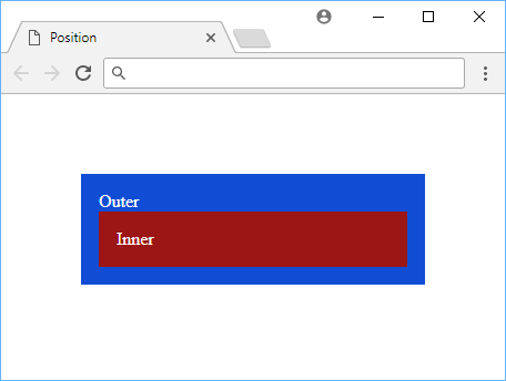 A box inside a box.
Relative Position
When you use relative, you can specify an offset from where it would usually render with the top, bottom, left, right properties.
Let's shift the inner box relative to the outer box.
HTML<!DOCTYPE html>
<html>
    <head>
        <title>Position: Relative</title>
        <style>
            body {
                padding: 4rem;
                color: white;
            }

            .outer {
                background-color: #104dd4;
                padding: 1rem;
            }

            .inner {
                background-color: #9c1616;
                padding: 1rem;
                position: relative;
                top: 2rem;
                left: 1rem;
            }
        </style>
    </head>
    <body>
        <div class="outer">
            Outer
            <div class="inner">
                Inner
            </div>
        </div>
    </body>
</html>
 An example of relative.
Notice how compared to the original layout where the inner box was neatly inside the outer box?
In the new layout, the browser first calculates the position of where the box should be, then offsets it by the given numbers, in this case top: 2rem; and left: 1rem;.
Absolute Position
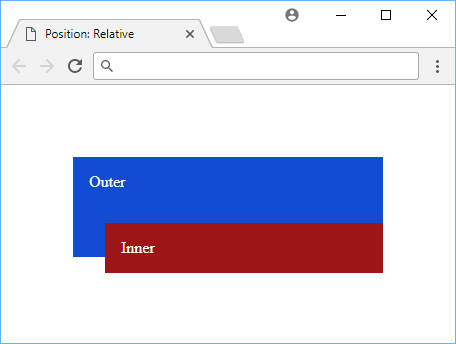
The absolute value has a few interesting properties to it. It acts like relative except that instead of being relative to its original position, it will be relative to the closest parent that has a position value other than static.
HTML<!DOCTYPE html>
<html>
    <head>
        <title>Position: Absolute</title>
        <style>
            body {
                padding: 4rem;
                color: white;
            }

            .outer {
                background-color: #104dd4;
                padding: 1rem;
            }

            .inner {
                background-color: #9c1616;
                padding: 1rem;
                position: absolute;
                top: 2rem;
                left: 1rem;
            }
        </style>
    </head>
    <body>
        <div class="outer">
            Outer
            <div class="inner">
                Inner
            </div>
        </div>
    </body>
</html>
 An example of absolute.
In our example, that parent will just be the body, so that's why when you apply the same top and left values, the box moves relative to the page (body) instead of the outer box.
Fixed Position
The fixed value acts very similarly to absolute except that it will be positioned relative to the browser's window, and stay in that spot even when the page is scrolled up or down.
HTML<!DOCTYPE html>
<html>
    <head>
        <title>Position: Fixed</title>
        <style>
            body {
                padding: 4rem;
                color: white;
            }

            .outer {
                background-color: #104dd4;
                padding: 1rem;
            }

            .inner {
                background-color: #9c1616;
                padding: 1rem;
                position: fixed;
                top: 0;
                left: 0;
            }
        </style>
    </head>
    <body>
        <div class="outer">
            Outer
            <div class="inner">
                Inner
            </div>
        </div>
    </body>
</html>
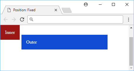 An example of fixed.
You can see on the right that my scrollbar is halfway but the inner box is still positioned top: 0; and left: 0; relative to the screen.
Sticky Position
The sticky value acts like absolute until you scroll down far enough which it then becomes fixed. This is useful for elements that need to stay at the top of the page, but only when you scroll down.
HTML<!DOCTYPE html>
<html>
    <head>
        <title>Position: Sticky</title>
        <style>
            div {
                height: 3rem;
            }

            div:nth-child(odd) {
                background-color: lightblue;
            }

            div:nth-child(even) {
                background-color: pink;
            }

            div.sticky {
                position: sticky;
                background-color: red;
                top: 0;
            }
        </style>
    </head>
    <body>
        <div>I am not sticky!</div>
        <div class="sticky">I am sticky!</div>
        <div>I am not sticky!</div>
        <div>I am not sticky!</div>
        <div>I am not sticky!</div>
        <div>I am not sticky!</div>
        <div>I am not sticky!</div>
    </body>
</html>
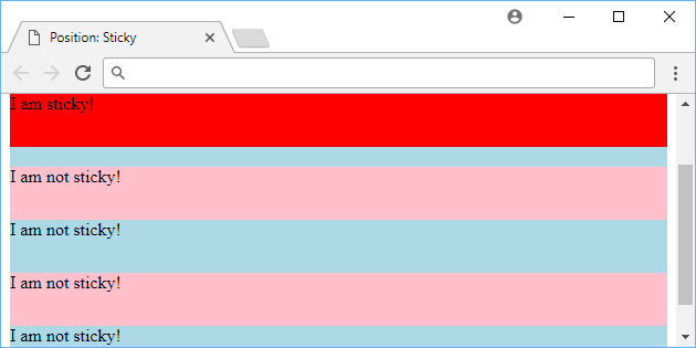 An example of sticky.
Try the demo of this below!
Essentially, if you want an element to remain on the page but allow for some scrolling, you can use sticky. It will appear naturally on the screen but never fully exit it after you scroll as it will just stick to the top of the page.
Resources
 Getting Started with TypeScript
 How to Install Node on Windows, macOS and Linux
 Getting Started with Solid
 Getting Started with Electron
 Git Tutorial: Learn how to use Version Control
 How to Set Up Cron Jobs in Linux
 How to deploy a PHP app using Docker
 How to deploy an Express app using Docker
 Using Puppeteer and Jest for End-to-End Testing
 Build a Real-Time Chat App with Node, Express, and Socket.io
 Setting Up a Local Web Server using Node.js
 How To Create a Modal Popup Box with CSS and JavaScript