Table of Contents
At-rules in CSS allow you to do many cool things like importing other stylesheets, embedding your fonts and targeting your styles for specific media types.
All at-rules start with the at sign (@). Let's look at some of the most common ones.
Importing Stylesheets
The @import rule is used when you want to import a stylesheet. This is useful for when you want to break up a larger stylesheet into smaller files, and then import then individually.
HTML<!DOCTYPE html>
<html>
    <head>
        <title>@import</title>
        <style>
            @import url('styles.css');
        </style>
    </head>
    <body>

    </body>
</html>
All you need to do is provide a url and the browser will go and fetch it.
An important thing to note is that @import needs to come before any styles do. This is because the browser will go and fetch the stylesheet before it can start parsing the styles.
Embedding Fonts
In an earlier lesson, we went over web safe fonts, basically fonts that are safe to use. But what if you want to use a custom font that perhaps many users will not have installed?
Enter the @font-face rule. You can import any font you want like this:
CSS@font-face {
    font-family: "font_name";
    src: url(font.font_extension);
}
All you need to do is give the font a name and point the browser to the file itself. The recommended font formats are .woff, .woff2, and .tiff.
You could even use all three formats by providing the browser a list of fonts, like this:
CSS@font-face {
    font-family: "font_name";
    src: url(font.woff),
        url(font.woff2),
        url(font.tiff);
}
Optionally, you can also define the font's weight and style. These are optional, but you can use them to make sure that the browser will load the correct font for your users.
CSS@font-face {
    font-family: "font_name";
    src: url(font.woff),
        url(font.woff2),
        url(font.tiff);
    font-weight: 400;
    font-style: normal;
}
Media Queries
Media queries are used to target your styles for a specific form of media. This is accomplished with the @media at-rule.
When you try and print a webpage, if the website is kind enough to supply print styles, the browser will apply them, hopefully making the pages print-friendly in the process.
Let's say you wanted to make the font sizes bigger for print. This is how you would do it:
CSS@media print {
    body {
        font-size: 125%;
    }
}
When you go and print, the words will now be bigger than normal. It's that simple.
Screen Size
A massive part of mobile-first web design revolves around the technique of applying different styles depending on the browser screen.
Maybe you want to hide certain elements on mobile or show additional elements when on desktop. Both are possible with screen media queries.
For example, let's make it so that when your screen is smaller than 600px the page's background color will be blue, but any larger and it is red.
HTML<!DOCTYPE html>
<html>
    <head>
        <title>Width Media Query</title>
        <style>
            @media screen and (max-width: 600px) {
                body {
                    background-color: blue;
                }
            }

            @media screen and (min-width: 600px) {
                body {
                    background-color: red;
                }
            }
        </style>
    </head>
    <body>

    </body>
</html>
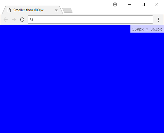 Smaller than 600px.
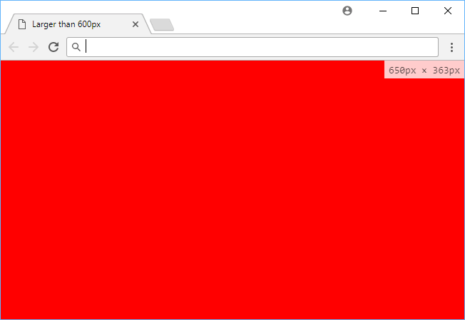 Larger than 600px.
That is the very basics of responsive design, trying to tailor the styles depending on the screen size viewing the page.
If your website is complex enough, you could essentially have different designs for when the page is loaded on mobile and loaded on desktop.
Resources
 Getting Started with TypeScript
 Getting Started with Express
 Create an RSS Reader in Node
 Getting Started with Electron
 How to deploy a .NET app using Docker
 How to deploy a PHP app using Docker
 Getting Started with Deno
 Getting User Location using JavaScript's Geolocation API
 Creating a Twitter bot with Node.js
 Using Push.js to Display Web Browser Notifications
 Getting Started with React
 Setting Up a Local Web Server using Node.js