Table of Contents
2D Transforms
With the transform property, you can manipulate an element's angle, size, shape, position, and many others properties. The syntax for transform is simple, and looks like this:
CSStransform: function(values);
You simply indicate the function you want to apply, pass in some values and let the browser do the work.
2D Translate
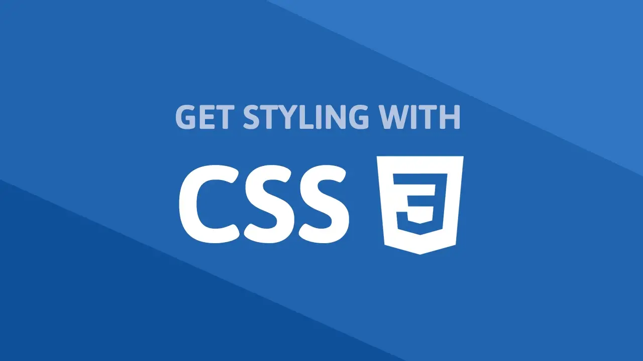
Perhaps the easiest function to demonstrate is the translate function.
Acting similar to using position: relative and giving it a left and top value, it moves the element horizontally and vertically. The units for translate is a length.
HTML<!DOCTYPE html>
<html>
    <head>
        <title>Transform: Translate</title>
        <style>
            .box {
                height: 5rem;
                width: 5rem;
                background-color: darkgreen;
                transform: translate(10rem, 1rem);
            }
        </style>
    </head>
    <body>
        <div class="box"></div>
    </body>
</html>
 Translating a box 10rems to the right, and 1rem down.
CSStransform: translate(x, y);
The first value (x) defines how far to translate the element horizontally, and the second value (y) for how far to translate it vertically.
2D Rotate
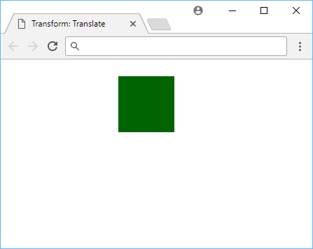
You can rotate an element by using the rotate() function, and passing in a degree value.
Passing in a positive value will make it rotate clockwise and a negative one will make it rotate counter-clockwise.
HTML<!DOCTYPE html>
<html>
    <head>
        <title>Transform: Rotate</title>
        <style>
            .box {
                height: 5rem;
                width: 5rem;
                margin: 5rem;
                background-color: purple;
                transform: rotate(45deg);
            }
        </style>
    </head>
    <body>
        <div class="box"></div>
    </body>
</html>
 Rotating a box 45 degrees.
CSStransform: rotate(xdeg);
2D Scale
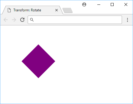
You can scale up and down the apparent size of an element using the scale function. The default value is1 where any smaller value makes the element appear smaller, and any value bigger makes the element appear larger.
HTML<!DOCTYPE html>
<html>
    <head>
        <title>Transform: Scale</title>
        <style>
            .box {
                height: 5rem;
                width: 5rem;
                background-color: pink;
                transform: scale(0.75, 1.25);
                margin: 5rem;
            }
        </style>
    </head>
    <body>
        <div class="box"></div>
    </body>
</html>
 Scaling a box.
CSStransform: scale(x, y)
Notice how two values were passed to scale? The first value is for the x and the second is for the y.
The width of the box was made to be 75% of the original width, and the height 125% of the original height.
2D Skew
Skewing an element lets you distort an element by adjusting the tilt on the horizontal and/or vertical axis. The value for the skew function is in degrees.
HTML<!DOCTYPE html>
<html>
    <head>
        <title>Transform: Skew</title>
        <style>
            .box {
                height: 5rem;
                width: 5rem;
                background-color: red;
                transform: skew(5deg, 10deg);
                margin: 5rem;
            }
        </style>
    </head>
    <body>
        <div class="box"></div>
    </body>
</html>
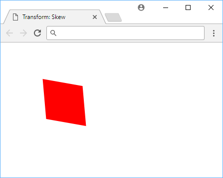 Skewing a box 5 degrees in the X-axis and 10 degrees in the Y-axis.
CSStransform: scale(xdeg, ydeg)
Transform Origin
The origin of every transform you perform will be, by default, at the very center of the element. This means that the element will be rotated, scaled, and skewed around the center of the element.
That is why when you try, for example, to rotate a box, it will rotate about the very center. If you wanted to rotate it around one of its edges, well, you're in luck.
Using transform-origin, you can set the origin to wherever you want it to be. The default value is:
CSStransform-origin: 50% 50%;
Multiple Transforms
In the event that one transform doesn't satisfy you, you can easily apply multiple at once by combining them. This is done by separating them with a space. The order of the transforms matter, so the order in which you apply them matters. The order of the transforms is important.
All you need to do is supply the transform property with your list of functions, and the browser will do the rest. Let's say you wanted to skew and scale a box:
HTML<!DOCTYPE html>
<html>
    <head>
        <title>Multiple Transforms</title>
        <style>
            .box {
                height: 5rem;
                width: 5rem;
                margin: 5rem;
                background-color: darkred;
                transform: skew(5deg, 7deg) scale(1.25, 2);
            }
        </style>
    </head>
    <body>
        <div class="box"></div>
    </body>
</html>
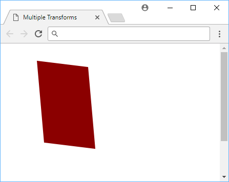 Skewing and scaling a box at the same time.
CSS transforms are a powerful way to manipulate the appearance of an element. Use them to create interesting effects, or just to make your page look a little better.
Resources
 How to Install Node on Windows, macOS and Linux
 Getting Started with Solid
 How to Set Up Cron Jobs in Linux
 How to deploy a Deno app using Docker
 Getting Started with Deno
 How to deploy a MySQL Server using Docker
 Getting Started with Sass
 Build a Real-Time Chat App with Node, Express, and Socket.io
 Getting Started with Moment.js
 Building a Real-Time Note-Taking App with Vue and Firebase
 Setting Up a Local Web Server using Node.js
 Using Axios to Pull Data from a REST API