Table of Contents
The CSS box model is a very important concept to grasp. The box model is a way to describe the layout of an element and its content. The most important CSS properties we will go over are padding, border, and margin.
Here is a nice diagram of the CSS box model:
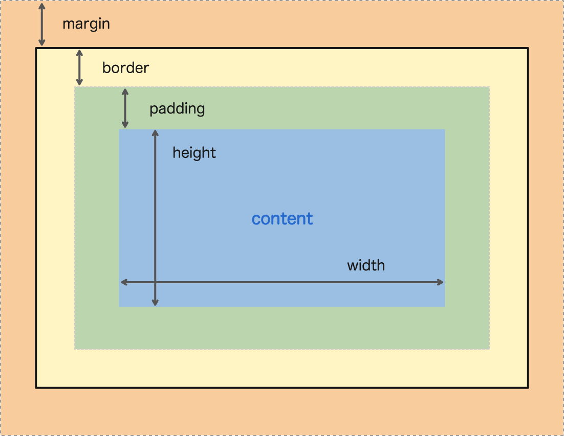 Diagram of the CSS Box Model. Notice the content inside padding, inside border, inside margin?
Content
You can consider every HTML element as just a box. Inside that box, basically everything in between tags, is considered content.
HTML<span>I am content.</span>
Width and Height
You can give an element with content a custom width and height by using the width and height CSS properties.
Here's an example:
HTML<!DOCTYPE html>
<html>
    <head>
        <title>Width and Height</title>
        <style>
            .content {
                background-color: pink;
                width: 20rem;
                height: 10rem
            }
        </style>
    </head>
    <body>
        <div class="content">
            This is content.
        </div>
    </body>
</html>
- HTML
- CSS
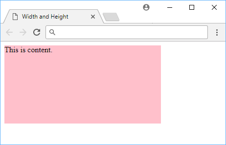 Using width and height in CSS.
The background color was added so that you can clearly see the boundaries of the newly-expanded element. The width and height were set to 20rem and 10rem respectively.
Minimum Width and Height
Give an element a minimum width and height using min-width and min-height to ensure that the element is at least a certain size. Here's an example:
HTML<!DOCTYPE html>
<html>
    <head>
        <title>Min Width and Height</title>
        <style>
            .content {
                background-color: pink;
                width: 20rem;
                height: 10rem;
                min-width: 25rem;
                min-height: 15rem;
            }
        </style>
    </head>
    <body>
        <div class="content">
            This is content.
        </div>
    </body>
</html>
- HTML
- CSS
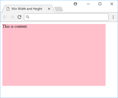 Using minimum width and height in CSS.
Notice how even though we set the width and height to be 20rem and 10rem respectively, the element is still larger because the minimum values we gave to the width and height exceed those values.
Maximum Width and Height
Setting the maximum width and height of an element is just as easy as setting the minimum. Use max-width and max-height and give it a value. Here's an example:
HTML<!DOCTYPE html>
<html>
    <head>
        <title>Max Width and Height</title>
        <style>
            .content {
                background-color: pink;
                width: 20rem;
                height: 10rem;
                max-width: 15rem;
                max-height: 5rem;
            }
        </style>
    </head>
    <body>
        <div class="content">
            This is content.
        </div>
    </body>
</html>
- HTML
- CSS
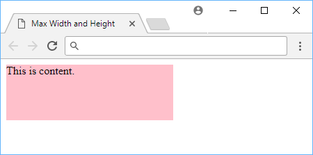 Using maximum width and height in CSS.
As you would expect, the element does not get larger than the specified maximum, even if another CSS rule sets it higher.
Padding
Padding is space added between the content and the border of its own box. You can declare it using the padding property, and giving it a length.
Here's an example:
HTML<!DOCTYPE html>
<html>
    <head>
        <title>Padding</title>
        <style>
            div {
                background-color: lightblue;
            }
            .no-padding {
                padding: 0;
            }
            .some-padding {
                padding: 2rem;
            }
        </style>
    </head>
    <body>
        <div class="no-padding">I have no padding</div>
        <br>
        <div class="some-padding">I have some padding</div>
    </body>
</html>
- HTML
- CSS
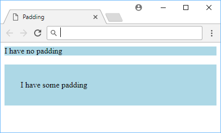 Example of padding.
As the image shows, the element that got some padding appears larger than the element that got zero padding. The blue background helps to illustrate where the element's borders are.
You can also set padding on each side individually, by using padding-top, padding-right, padding-bottom, or padding-left.
Border
At the edge of the content plus the padding you defined is the start of the element's border. By default, an element will not have a border, but you can define one with the border property.
The syntax for it is the width or thickness of the border, the style, and then the color.
For example, if you wanted a blue, dashed, 2 pixels thick border, it would look like this:
HTML<!DOCTYPE html>
<html>
    <head>
        <title>Border</title>
        <style>
            .blue-border {
                border: 2px dashed blue;
                padding: 1rem;
            }
        </style>
    </head>
    <body>
        <div class="blue-border">Sweet border!</div>
    </body>
</html>
- HTML
- CSS
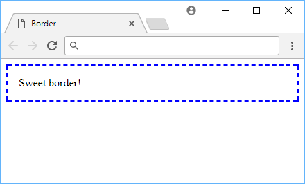 Example of a border.
Here are other border styles you can use:
soliddotteddasheddoubleinsetoutsetgrooveridge
Borders can be applied to most elements.
Border Radius
One way you can customize borders is by setting a border radius. You can round off the borders of your element using border-radius, like this:
HTML<!DOCTYPE html>
<html>
    <head>
        <title>Border Radius</title>
        <style>
            .rounded-corners {
                border: 0.5rem solid purple;
                padding: 1rem;
                border-radius: 1rem;
            }
        </style>
    </head>
    <body>
        <div class="rounded-corners">Rounded corners!</div>
    </body>
</html>
- HTML
- CSS
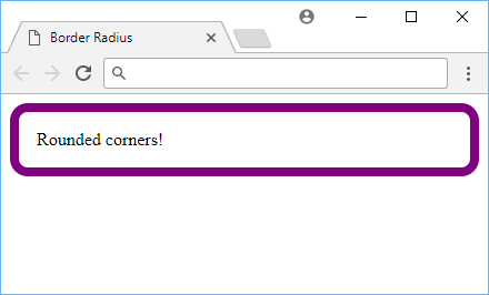 Example of a border radius.
The value for this property is any length of your choosing. The default value is 0, which means that the border will not be rounded. You can also use 50% to round off the border fully.
Box Shadow
You can add a shadow to an element by using the box-shadow property. The syntax is the same as for borders, but you can also use inset and outset to make the shadow appear inside or outside of the element.
For the most common uses of this property, it takes five values, the horizontal offset, the vertical offset, the blur radius, the size of the shadow and finally, the color. The color is optional, and if you don't specify it, the shadow will be black. Here's an example:
HTML<!DOCTYPE html>
<html>
    <head>
        <title>Box Shadow</title>
        <style>
            .box-shadow {
                background-color: lightpink;
                border: 0.25rem solid red;
                padding: 1rem;
                margin: 2rem;
                box-shadow: 0.5rem 0.5rem 0.25rem darkgray;
            }
        </style>
    </head>
    <body>
        <div class="box-shadow">Box shadow!</div>
    </body>
</html>
- HTML
- CSS
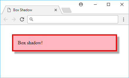 Example of a box shadow.
Box shadows can be applied to most elements.
Margin
To add space around an element, you can use the margin property. It takes a length and can be applied to all four sides of the element. Unlike padding, which was spacing inside the element's border, margin is spacing outside the element's border, and you declare it using margin.
Here's an example:
HTML<!DOCTYPE html>
<html>
    <head>
        <title>Margin</title>
        <style>
            span {
                background-color: green;
                padding: 0.5rem;
                border-radius: 0.25rem;
                display: inline-block;
            }
            .low-space {
                margin-left: 1rem;
            }
            .med-space {
                margin-left: 5rem;
            }
            .high-space {
                margin-left: 10rem;
            }
        </style>
    </head>
    <body>
        <span class="low-space">A</span>
        <span class="med-space">B</span>
        <span class="high-space">C</span>
    </body>
</html>
- HTML
- CSS
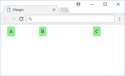 Example of margin.
While a difficult concept to illustrate, it should be clear to see that the more margin on the left side of the element, the further away it goes, despite the fact that all the elements have the same amount of padding.
This is because, again, padding affects only inside the element's border while margin affects what is outside it.
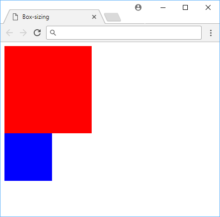
Box Sizing
The box-sizing property exists to allow you to control how an element's width and height is calculated. It only has two values so this one is pretty simple to demonstration.
The first value is content-box. This is the default value. This value makes it so that the width and height is only determined by the content itself. Any padding or border is extra and makes the element bigger.
The second value is border-box. This does the opposite effect. All additional padding and border are now included in the width and height. This means that if you constrain an element to a specific size, any added padding and border will simply make the remaining content space smaller to maintain that overall total size. This is useful for things like making a div that is always the same size, but has a different content inside.
Let's look at a simple example of the same box with two different sizes because of different box-sizing values for this HTML:
HTML<div class="box content-box"></div>
<div class="box border-box"></div>
We apply these styles:
CSS.box {
    width: 5rem;
    height: 5rem;
    border-width: 1rem;
    padding: 3rem;
}
.content-box {
    box-sizing: content-box;
    background-color: red;
}
.border-box {
    box-sizing: border-box;
    background-color: blue;
}
- HTML
- CSS
 Example of the difference in box sizing.
Because the red square applies the padding and border on top of it's normal width and height, it appears way bigger than the blue square who keeps itself at 5rem for its width and height no matter what. This is because the blue square is using border-box and the red square is using content-box.
Resources
- Padding - MDN Web Docs
- Margin - MDN Web Docs
- Border - MDN Web Docs
- Box Model - MDN Web Docs
- Border Radius - MDN Web Docs
- Box Shadow - MDN Web Docs
 Getting Started with Solid
 Managing PHP Dependencies with Composer
 Create an RSS Reader in Node
 How to build a Discord bot using TypeScript
 Getting Started with Deno
 How to deploy a MySQL Server using Docker
 Learn how to use v-model with a custom Vue component
 Getting User Location using JavaScript's Geolocation API
 Learn how to build a Slack Bot using Node.js
 Creating a Twitter bot with Node.js
 Setting Up Stylus CSS Preprocessor
 Using Axios to Pull Data from a REST API